**About the Author:**

Kamal Uddin is a professional video editor and colorist with over seven years of industry experience. Having worked on commercial campaigns, independent short films, and corporate brand videos, Kamal specializes in creating clean, cinematic aesthetics and optimizing post-production workflows. Through this guide, he shares his practical, real-world color grading framework to help creators of all skill levels elevate their visual storytelling and produce high-end content.

The Secret Pain of Dull, Grey, and Amateur-Looking Video Footage

You spend hours planning your video shoot. You set up your camera, adjust your lights, and record what you think is a masterpiece. But when you import the files into your computer, a wave of disappointment hits you.

The footage looks flat, lifeless, and incredibly cheap. It does not look like the movies you watch on Netflix or YouTube. Instead, it looks like a cheap home video shot on an old phone. This is a common struggle that leaves many creators feeling defeated and ready to quit.

You might feel like you need to buy a ten-thousand-dollar camera to get that beautiful film look. That thought is both draining and untrue. The real problem is not your camera. The real problem is that you do not know how to handle the colors of your footage in post-production.

Why You Keep Failing to Get That Film Look

Most creators fall into the same traps when trying to fix their video colors. Here are the main reasons why your videos still look amateur:

  • The Magic LUT Trap: You download free cinematic LUTs online and slap them directly onto your raw footage. This makes your video look muddy, overly saturated, or completely ruined.
  • Skipping the First Step: You try to color grade before correcting your exposure and white balance. You cannot paint a beautiful house on a broken foundation.
  • Over-Saturating the Scene: You think cinematic means bright, intense colors. In reality, modern films use subtle, controlled palettes to tell their stories.
  • Trusting Your Eyes Alone: You do not use professional color scopes. Your eyes get tired quickly, leading you to make bad color choices without realizing it.

How Bad Colors Destroy Your Confidence as a Creator

When your videos do not look the way you want, it takes a heavy toll on your mind. You begin to doubt your creative talent and wonder if you are cut out for filmmaking.

  • Client Rejection: You send work to clients, only for them to ask why the video looks "cheap" or "unpolished." This makes you feel anxious every time you hit the send button.
  • Social Media Silence: You upload videos to YouTube or Instagram, but viewers scroll past them. The flat look fails to grab their attention in their busy feeds.
  • Fear of Sharing: You keep your projects hidden on your hard drive. You are too embarrassed to show your friends and family what you have created.
  • Financial Stress: You hesitate to charge high prices for your video services. You feel like a fraud because your work does not match the quality of professional agencies.
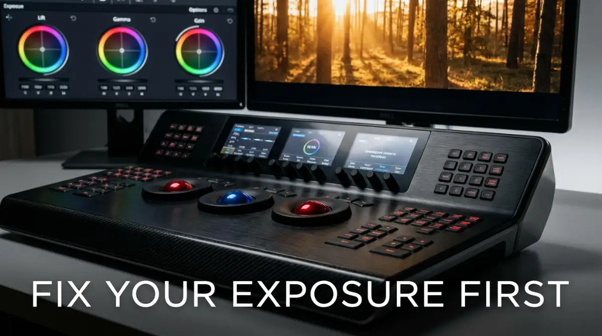

The True Blueprint to Crafting a Cinematic Masterpiece

To fix these problems, you need to change your approach. Color grading is not about clicking a random preset button. It is a systematic process that combines science with art.

Once you learn the correct steps, your videos will look rich, deep, and professional. Let us break down this process into easy, actionable steps that you can start using today.

The Two Pillars: Color Correction vs. Color Grading

Before we touch any dials, we must understand the difference between correction and grading. Many people use these terms interchangeably, but they are completely different stages of editing.


+-------------------------------------------------------------------+
| Color Correction (The Foundation) | Color Grading (The Art)      |
+-------------------------------------------------------------------+
| Fixes exposure and contrast issues| Creates a specific mood      |
| Balances white and black levels   | Adds stylistic color tones   |
| Makes the footage look natural    | Gives the movie-like aesthetic|
| Done first in the editing chain   | Done last in the editing chain|
+-------------------------------------------------------------------+


Think of color correction as cleaning a canvas. Think of color grading as painting the actual picture on that clean canvas. If you try to paint on a dirty canvas, the colors will mix with the dirt and look terrible.

### Grab Your Free Practice Footage (Follow Along!)

Before we dive into the step-by-step process, we highly recommend practicing these techniques on real footage. We have prepared a free, downloadable sample folder containing raw, uncorrected Log footage and successfully graded clips. 

"Click the link below to download the official practice folder, which includes a 10-second raw S-Log3 sample clip, a fully corrected Rec.709 reference file, and our custom utility LUT for comparison.

πŸ‘‰ Download Free Practice Footage & Project Assets Here (ZIP, 45MB) (Note: Hyperlink this text with your actual file hosting link, such as Google Drive or Dropbox)"

Import these files into your favorite software and try to match the settings as we go through each step of this tutorial.

Step 1: Preparing Your Clean Canvas (Primary Correction)

Understanding the Log Profile: Why Flat is Better

Before adjusting your sliders, it is important to understand why professional cameras shoot such dull, flat footage in the first place. This profile is called "Log" (short for logarithmic).

Unlike standard profiles (like Rec.709) which bake contrast and color directly into the file, a Log profile preserves the maximum dynamic range of your camera sensor.

By capturing washed-out highlights and muddy shadows, the camera saves crucial visual data in both the brightest skies and the darkest corners. This gives you the flexibility to recover lost details during post-production.

Popular variations include Sony’s S-Log3, Canon’s C-Log3, and Panasonic’s V-Log. If you do not shoot in Log, your highlights may clip (turn pure white) or your shadows may crush (turn pure black) permanently, leaving you with no data to adjust.

Your first goal is to make your video look exactly like your eyes saw the scene in real life. We do this by adjusting the exposure, contrast, and white balance.

Balancing the Light with Exposure and Contrast

Open your editing software and load your footage. Look at your Waveform Monitor instead of just trusting your computer screen. Your screen might be too bright or too dark, which will lie to your eyes.


100 IRE [------------------------] (Clipping/Whites)
          [                        ]
   50 IRE [------------------------] (Midtones/Skin)
          [                        ]
    0 IRE [------------------------] (Crushing/Blacks)


Figure 1: The Waveform Monitor displays the luminance (brightness) levels of your video from left to right, mapping directly to the horizontal pixels in your frame. The vertical scale represents brightness from 0 IRE (absolute black, or shadows) to 100 IRE (absolute white, or highlights). To prevent losing details, adjust your exposure so your brightest highlights sit around 90-95 IRE and your deepest shadows rest slightly above 0 IRE (around 2-5 IRE).

Sculpting Contrast with the Custom Curves (The S-Curve)

While the contrast slider is a quick way to add punch to your image, professional colorists prefer using the Custom Curves panel for precise control. To create organic, film-like contrast, you need to draw a subtle "S-Curve" on your luma curve graph:

  1. Add Three Points: Click on the diagonal line in the curves panel to create three adjustment pointsβ€”one in the lower-third (Shadows), one in the exact middle (Midtones), and one in the upper-third (Highlights).
  2. Pull the Shadows Down: Gently drag the lower shadow point downward. This deepens your blacks and adds rich contrast.
  3. Push the Highlights Up: Gently drag the upper highlight point upward. This brightens your whites and midtones without clipping.
  4. Keep Midtones Neutral: Leave the middle point near the center to ensure your subject's face and natural skin tones remain unaffected by the contrast shift.

This classic "S-Curve" mimics the natural contrast roll-off of physical celluloid film, giving your digital footage an instant organic texture.
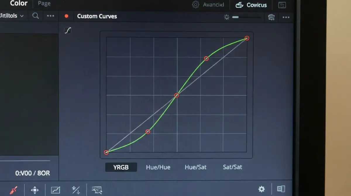
[ A close-up screenshot of the DaVinci Resolve Custom Curves panel displaying a classic, subtle "S-Curve" with three control points placed on the diagonal line, demonstrating how the highlights are gently pushed up and shadows are pulled down.]

Understanding Luma Waveform vs. RGB Parade Scopes

While a standard Luma Waveform monitor shows you the overall brightness levels (luminance) of your image from black to white, it does not display individual color channels.
To see if your image has an unwanted color cast in the shadows or highlights, you should switch to the RGB Parade scope. The RGB Parade splits your image into Red, Green, and Blue channels side-by-side.
If the blue waveform in the shadow area is significantly higher than the red and green waveforms, your shadows will have an unwanted cold, blue tint. Balancing your exposure using both Luma and RGB scopes ensures your foundations are mathematically neutral before any creative choices are made.


Adjust your exposure slider so your brightest highlights sit just below the 100 line on the waveform. Next, pull your shadows down so they sit slightly above the 0 line. This simple adjustment instantly brings back the depth in your video.

Fixing the White Balance

If your white balance is off, your video will look too blue or too yellow. This makes human skin look sick or unnatural.

Find something in your shot that should be pure white or neutral grey, like a white shirt or a concrete wall. Use your software’s eyedropper tool to click on that white spot. The software will automatically adjust the temperature and tint sliders to make the white look truly white.

If you do not have an eyedropper tool, manually adjust the temperature slider. Move it toward blue if the shot is too yellow, or toward orange if the shot is too cold.

### Quick UI Guide: How to Apply Primary Corrections

If you are unsure where to find these specific sliders in your software, here is your quick-start roadmap:

(Note: The UI paths and features mentioned below are fully optimized for DaVinci Resolve 19 and Adobe Premiere Pro 2026. If you are using older versions, the core color science remains identical, though some icon placements may slightly differ.)

***In DaVinci Resolve (Color Page):**

  1. Navigate to the bottom-left panel to find the **Primary Wheels** palette.

  2. Look at the adjustment parameters underneath the wheels: **Lift** (Shadows), **Gamma** (Midtones), and **Gain** (Highlights).

  3. Double-click the **Temp** (Temperature) and **Tint** input fields right above the wheels to manually type numerical corrections or drag them left/right.

***In Adobe Premiere Pro (Lumetri Color Panel):**

  1. Open the **Basic Correction** tab inside the Lumetri Color panel on your right screen.

  2. Use the **Exposure**, **Contrast**, **Highlights**, and **Shadows** sliders under the **Tone** section to adjust your waveform levels.

  3. Use the **Temperature** and **Tint** sliders under the **White Balance** (WB) section to manually neutralize unwanted color casts.

Step 2: Sculpting with the Primary Color Wheels

Once your image looks clean and natural, it is time to shape the light. We do this using the primary color wheels: Lift, Gamma, and Gain.

Lift (The Shadows)

The Lift wheel controls the darkest parts of your video. If you want a moody, cinematic look, you can pull the Lift wheel down slightly.

Be careful not to pull it too far down, or you will lose all the details in the dark areas. In professional terms, this is called "crushing your blacks."

Gain (The Highlights)

The Gain wheel controls the brightest parts of your video, like the sky or bright lights. Push the Gain wheel up to make your highlights pop and look alive.

Always watch your scopes while doing this. If your highlights go past the 100 mark on your waveform, you will lose all detail in those bright areas.

Gamma (The Midtones)

The Gamma wheel controls everything in the middle, including human skin tones. This is where the magic happens.

If your video feels too heavy or dark, raising the Gamma wheel will brighten the image without ruining your shadows or highlights. It keeps the image balanced and natural.

Offset (The Global Tone)

The Offset wheel shifts the entire image at once. If your entire clip has a strange green color cast, you can push the Offset wheel toward magenta to fix the whole image instantly.

Myth vs. Reality: The Truth About Cinematic LUTs

There is a huge misunderstanding about what LUTs (Look-Up Tables) actually do. Let us bust some common myths.

  • Myth: Applying a cinematic LUT will instantly make my cheap footage look like a Hollywood film.
  • Reality: LUTs only work correctly if your footage is already corrected for exposure and color balance.
  • Myth: The more expensive the LUT pack, the better my video will look.
  • Reality: A cheap or free LUT used correctly on balanced footage looks far better than an expensive LUT slapped on bad footage.
  • Myth: Professional colorists only use LUTs to grade their movies.
  • Reality: Professionals use LUTs as a quick starting point, but they do ninety percent of their work manually using color wheels and curves.

Step 3: Protecting Your Skin Tones (HSL Secondary Tuning)

You can have the most beautiful blue and orange background in the world, but if your subject's skin looks green or purple, your video is ruined. Human eyes are incredibly good at recognizing when human skin looks unnatural.

Using the Vector scope to Find the Skin Tone Line

Open your Vector scope in your editing software. You will see a straight diagonal line running between the red and yellow indicators. This is the Skin Tone Indicator Line.


[Red]
               \  <-- Skin Tone Line
                \
   [Yellow] -----*----- [Blue]
                /
               /
             [Green]


Figure 2: The Vectorscope measures hue (color direction) and saturation (distance from the center). The diagonal line running toward the upper-left (at approximately -123 degrees, between Red and Yellow) is the universal Skin Tone Indicator.

Ensure the densest concentration of your skin-isolated pixels aligns directly along this line, regardless of the subject's ethnicity, to guarantee a natural look.

Every human being, regardless of their race or skin color, sits on this exact same line on the vectorscope. The only difference is how close they sit to the center (how saturated their skin color is).

Isolating the Skin with HSL Qualifiers

Use your HSL (Hue, Saturation, Lightness) qualifier tool to select the skin of your subject. Once selected, look at your vectorscope to see if the colors align with the skin tone line.

If the skin color is leaning too far toward red, push the tint of your selection toward yellow. If the skin color is too yellow, push it slightly toward red. This keeps your actor looking healthy and realistic.

Once you lock in the skin tones, you can change the colors of the background without affecting your subject. This separation is what gives films that deep, high-end three-dimensional feel.

To pull a clean skin tone key using the HSL Qualifier: First, select the color picker tool and click on a mid-tone area of the subject's face. Turn on the highlight view (Shift+H in DaVinci Resolve) to see what is selected.

Gently widen the Hue (H) slider to capture both the red and yellow spectrums of the skin. Next, adjust the Saturation (S) and Lightness (L) parameters to exclude background elements.

Finally, apply a subtle 'Blur Radius' (between 5.0 and 10.0) to soften the edges of your selection, preventing harsh digital outlines around the face.


[A 5-second repeating GIF showing how to use the qualifier eyedropper tool in Lumetri or Resolve to click on a subject's cheek, enabling the "Highlight/Mask" view, and adjusting the H, S, and L sliders to isolate the skin while excluding the background.]

Isolating Skin Tones in Adobe Premiere Pro (Lumetri HSL)

If you are using Adobe Premiere Pro instead of DaVinci Resolve, you can achieve the same skin tone isolation using the Lumetri Color panel. Expand the 'HSL Secondary' tab inside Lumetri Color. Use the key color eyedropper tool to click on the subject's skin.
Check the 'Color/Gray' mask checkbox to visualize your selection. Adjust the H (Hue), S (Saturation), and L (Luma) sliders to refine the selection, ensuring background elements are excluded. Use the 'Blur' slider under the correction wheels to soften the mask edges, which prevents pixelated transitions around the face.
Once isolated, you can use the single correction wheel below to subtly adjust the skin color without affecting the background.


Isolating Skin Tones in Final Cut Pro (Color Mask)

For Mac editors using Final Cut Pro, you can isolate skin tones using the built-in color masking features:

  1. Go to the Color Inspector and add a Color Board or Color Wheels effect.
  2. Click the Masks icon at the top of the inspector panel and select Add Color Mask.
  3. Your cursor will turn into an eyedropper. Click and drag over your subject's skin to select the color range.
  4. To visualize your mask, check the Show Mask option; the skin should appear white, and the rest of the image will be black.
  5. Use the Softness slider to smooth out the edges of your selection.
  6. Switch back to the color wheels to adjust only the selected area (the "Inside" of the mask) to align with the skin-tone line on your vectorscope.

Step 4: Crafting the Creative Cinematic Look

Now that your canvas is clean and your skin tones are protected, you can finally add your creative artistic look. This is where you decide the mood of your story.

The Classic Teal and Orange Look

The teal and orange look is the most popular style in modern cinema. This look works because teal and orange are complementary colors on the color wheel, creating natural contrast that pleases the eye.

To create this look, push your shadows (Lift) toward a cool teal or blue color. Next, push your midtones (Gamma) and highlights (Gain) toward a warm orange or gold color.

This makes your subject pop out from the background, creating a beautiful depth. It works incredibly well for action movies, travel vlogs, and outdoor scenes.

The Warm and Moody Look

If you are editing a cozy vlog, a romance scene, or a vintage film, you might want a warmer look. To achieve this, keep your shadows neutral or slightly warm.

Push your midtones and highlights toward soft yellows and oranges. Avoid using cold blues. This makes the entire scene feel comfortable, welcoming, and timeless.

The Cool and Desaturated Look

For thriller movies, sci-fi scenes, or dramatic stories, a cold look works best. Push your shadows and midtones toward blue and green.

Next, lower the overall saturation of your video by ten to fifteen percent. This creates an eerie, tense, and serious atmosphere that matches the drama of your story.

Comparing Top Video Editing Software for Color Grading

Not all editing software is built the same way when it comes to managing color. Here is a quick look at how the top programs compare.


+-------------------------------------------------------------------------+
| Software        | Color Tools Quality | Difficulty | Best For           |
+-------------------------------------------------------------------------+
| DaVinci Resolve | Outstanding         | High       | Professional Looks |
| Premiere Pro    | Very Good           | Medium     | Daily Content      |
| Final Cut Pro   | Good                | Low        | Fast Turnaround    |
| CapCut          | Basic               | Very Low   | Mobile & Shorts    |
+-------------------------------------------------------------------------+


### How to Access the Color Workspaces Instantly

If you are unsure where to start inside these applications, here is how to find the proper workspaces:

  • In DaVinci Resolve: Look at the bottom navigation bar and click on the Color page (indicated by a color wheel icon). This dedicated workspace gives you immediate access to nodes, curves, and scopes in a single workspace.
  • In Adobe Premiere Pro: Go to the top menu, select Window > Workspaces, and click on Color. This opens the Lumetri Color panel on the right side and the Lumetri Scopes on the left."

If you are serious about getting a truly professional look, learning the basic color workspace in DaVinci Resolve or Adobe Premiere Pro is highly recommended.

Pro Tips for Grading on Budget Monitors

You do not need a three-thousand-dollar color-accurate monitor to start. You can get great results on a budget screen if you follow these simple rules.

Always Use Your Scopes

We cannot repeat this enough. Your eyes will adjust to whatever screen you are looking at. If your screen has too much blue, you will naturally add yellow to your video to make it look right to you.

Your scopes do not lie. If the waveform monitor says your shadows are hitting zero, then your shadows are black, no matter what your cheap monitor shows. Learn to read the Waveform, Vectorscope, and Parade.

Grade in a Dim Room

Do not color grade your videos next to a bright window with sunlight pouring in. The changing daylight will make you change your grading choices constantly.

Work in a room with neutral, dim lighting. This keeps your eyes relaxed and helps you make consistent color choices across all your video clips.

Check Your Work on Multiple Devices

Before you export your final video, send a short test clip to your phone. Watch it on your phone screen, your tablet, or even your television.

This helps you see how the colors look on screens that normal people actually use. If the video looks good on your phone and your computer, you have achieved a solid, balanced grade.

Real-World Scenario: Fixing a Dark, Indoor Interview

Let us walk through a quick scenario to show you how these steps work in real life. Imagine you have a video of a person sitting in a dimly lit coffee shop.

First, you look at the waveform scope. The shadows are touching zero, but the midtones where the person's face sits are too low and dark.

You start by raising the Gamma wheel to bring light back to their face. Next, you notice the coffee shop lights look green, making the subject's skin look pale and sickly.

You select the skin using the HSL qualifier tool and adjust the tint until the skin dots line up on the skin tone line in your vectorscope. Instantly, the subject looks healthy and alive.

Finally, you push the shadows of the dark coffee shop background toward a deep warm brown. This makes the scene feel cozy, rich, and incredibly cinematic.

You did not buy a new camera or expensive lights. You simply used your editing tools to guide the viewer’s eyes to what matters most.

Advanced Color Science and the Magic of Node Workflows

When you are ready to move past the basic color wheels, you enter the world of professional color science. This is where film industry experts separate themselves from average video editors. If you want your videos to look like high-budget cinema, you need to understand how professional camera systems process color.

The Power of Color Space Transformations

Most professional cameras today record video in a format called "Log." Log footage looks incredibly flat and grey when you first look at it. This happens because the camera sensor is trying to capture as much highlight and shadow detail as possible.


+-----------------------------------------------------------------+
| Camera Sensor -> Log Profile -> Color Space Transform -> Rec.709 |
+-----------------------------------------------------------------+


Instead of using a simple creative LUT to convert this footage, you should use a Color Space Transform (CST) tool. Companies like Blackmagic Design and RED Digital Cinema use these math-based tools to convert flat colors into beautiful, natural images [1, 2].

To configure a Color Space Transform (CST) correctly in DaVinci Resolve, follow these step-by-step parameters in your inspector panel:

1. Create a dedicated node at the very beginning of your node network.

2. Open the **Effects** panel in the top-right corner, search for "Color Space Transform," and drag it onto that first node.

3. In the settings panel, set the **Input Color Space** and **Input Gamma** to match exactly what your camera used during recording (for example: *Sony S-Gamut3.Cine* and *Sony S-Log3* or *Canon Cinema Gamut* and *Canon Log 3*) [3].

4. Set your **Output Color Space** to *Rec.709* and your **Output Gamma** to *Gamma 2.4* (or use *Rec.709-A* if you are editing on macOS to prevent display gamma shifts).

For example, if you shot your footage on a Sony FX3 in CineEI mode, configure the CST settings as follows: Input Color Space: Sony S-Gamut3.Cine; Input Gamma: Sony S-Log3; Output Color Space: Rec.709; Output Gamma: Gamma 2.4. Set the Tone Mapping Method to 'DaVinci' (or Luminance Mapping) with a Max Output of 100 nits to guarantee a smooth roll-off in the bright sky and prevent harsh clipping.

[ A clear screenshot of the DaVinci Resolve OFX Inspector showing the exact settings of a Color Space Transform (CST) node, showcasing Input Color Space: Sony S-Gamut3.Cine, Input Gamma: Sony S-Log3, Output Color Space: Rec.709, and Output Gamma: Gamma 2.4.]

A CST converts your camera's specific color profile into a standard viewing profile called Rec.709. This process is much cleaner than a standard LUT because it preserves all the hidden details in your highlights and shadows. It keeps your image data safe from digital clipping and noise.

Parallel Processing with Node Networks

If you are using professional grading software, you will work with a system of connected blocks called "Nodes." Many beginners make the mistake of placing all their color adjustments inside a single node. This makes it impossible to adjust one color without ruining another.

Instead, you should use Parallel Nodes to separate your tasks. This allows you to work on different colors at the same time without them fighting each other.


+---> Node B: Skin Tone Adjustments ---+
                  |                                      |
  Input Node ---> +                                      +---> Output Node
                  |                                      |
                  +---> Node C: Background Cool Tones ---+


Figure 3: A professional node graph structure. Node 1 is reserved for exposure corrections; Node 2 handles white balance; Node 3 is a Color Space Transform (CST). This is followed by a Parallel Mixer containing Node 4 (Skin Tones) and Node 5 (Background Creative Grade), ensuring adjustments to the environment do not contaminate the skin. The pipeline concludes with Node 6 for Film Grain and final adjustments.

For example, you can use one node strictly for skin tones and another parallel node for your creative background colors. Since they run side by side, your background adjustments will not change the look of your skin tones. This clean setup is how professional colorists keep their images looking crisp and professional.

The Functional Difference: Serial Nodes vs. Parallel Nodes

To work efficiently in DaVinci Resolve, you must understand how image data flows through your node tree. A Serial Node (Alt+S) applies adjustments in a linear sequence; Node 2 receives the processed image from Node 1. If you heavily limit your key in Node 1, Node 2 only has access to that limited selection. A Parallel Node (Alt+P), on the other hand, allows multiple nodes to read from the exact same source image simultaneously. Their outputs are then mixed together using a Parallel Mixer node. This is crucial for creative grading because it allows you to manipulate background colors in one node while maintaining the full, uncompressed color data of your subject’s skin in a parallel node, preventing ugly artifacts where the two selections meet.


Recreating Classic Film Aesthetics with Halation and Grain

Real physical film has tiny imperfections that make it feel warm, organic, and emotional. Digital cameras, on the other hand, are often too sharp and perfect. To get a true cinematic look, we must carefully add some of these vintage imperfections back into our digital video.

One of the most important film elements is called Halation. Halation is the warm, reddish glow that appears around bright lights and high-contrast edges in classic films. You can add this look inside your color software by blurring your red channel slightly on high-contrast edges.

Next, you can add digital Film Grain to remove the clean, plastic look of digital camera sensors. Film grain adds a subtle movement to your image, which makes the background feel alive even when nothing is moving. Always apply your film grain at the very end of your node tree to ensure it looks natural.

Matching Multi-Camera Setups on the Same Timeline

If you are shooting a project with two different cameras, matching their colors can be a nightmare. A Sony camera will naturally look different from a Canon or an Arri camera [3]. This difference can ruin the immersion of your story if the colors jump around between shots.

To match them, you should use the RGB Parade scope in your video editor. Choose a neutral reference shot from your main camera and find a similar shot from your second camera.

Adjust the lift, gamma, and gain of your second camera until its red, green, and blue color bars match the height of your reference shot. This manual balancing is much more accurate than relying on automatic matching features.

When matching a Sony A7SIII to a Canon R5 on the same timeline, display the RGB Parade scope. Identify a neutral white or grey object present in both shots (such as a grey card or a white wall). Adjust the Canon footage's Lift and Gain wheels until the red, green, and blue waveforms align perfectly at the same height as the Sony reference shot. This mathematically matches the color response of both camera sensors before any creative grading is applied.

Building Long-Term Consistency in Your Color Grading

Learning to grade a single shot is great, but you must learn to maintain this quality across an entire project. Creating a visual identity for your channel or brand is what keeps viewers coming back for more.

Managing a massive multi-camera timeline without a structured system can quickly lead to visual chaos. By grouping your clips by scene or camera type, you can apply global grade adjustments to entire sequences simultaneously. This structured node or layer hierarchy keeps your workspace organized, allowing you to focus on creative consistency rather than repetitive manual adjustments.

You should organize your timeline into scenes so you can apply global adjustments to multiple clips at once.

Once you find a color style that fits your brand, save it as a "PowerGrade" or a template. This allows you to quickly import your signature look into future projects, saving you hours of work. It also builds a professional brand identity that clients will easily recognize.


Hidden Pitfalls That Can Instantly Destroy Your Video Quality

Even with the best tools, it is easy to make simple mistakes that ruin your hard work. Let us look at the most common color grading errors and how you can avoid them.

Trap 1: The Heavy-Handed Saturation Mistake

When people want a warm, vibrant look, they often slide the global saturation tool all the way up. This is a massive mistake that makes your video look like a cheap mobile phone recording.

High saturation causes the colors to bleed into each other, destroying all the fine details in your footage. Instead of using global saturation, try using the Saturation vs. Saturation curve.

This tool allows you to add saturation only to the dull parts of your image while leaving the already bright areas alone. It keeps your image looking natural and professional without clipping your color channels.

Trap 2: Grading Without Calibrating Your Workspace

Your computer screen might look beautiful to you, but if it is not calibrated, your viewers will see something completely different. This is one of the most frustrating problems for new video editors.

Missing a tiny detail in your screen setup can cause massive problems when your video is viewed on other devices.

Failing to account for display gamma shifts can lead to drastic color discrepancies when your video is exported. For example, rendering Rec.709 video on a macOS device without targeting the correct gamma profile (such as Gamma 2.4 vs 2.2 or Rec.709-A in DaVinci Resolve) often results in a washed-out, desaturated image on YouTube or QuickTime players. Workspace calibration ensures what you see on your screen is exactly what your viewers actually get.

If your monitor has a strong blue tint, you will naturally add orange to your video to make it look correct on your screen. However, when your viewers watch it on their phones, the video will look way too orange. To avoid this, always use professional SMPTE standards and use color scopes to guide your decisions [4].

The Infamous QuickTime Gamma Shift Explained

Have you ever graded a video to look rich and contrasty inside your editing program, only to export it and find that it looks washed out, pale, and desaturated when played in QuickTime or uploaded to YouTube? This issue is known as the "Mac Gamma Shift."

This happens because macOS uses a different display color management utility (ColorSync) which assumes a default Gamma of 1.96, while professional video standards (Rec.709) are designed around Gamma 2.4. Without proper color tagging during export, your operating system translates the colors incorrectly, stripping away your contrast and midtone density.

Quick Action Plan: Preventing the Mac Gamma Shift on Export

If you are editing on macOS and notice your exported video looks washed out compared to what you saw inside DaVinci Resolve, follow this standard workflow adjustment:
  1. Go to Project Settings > Color Management.
  2. Set your Timeline Color Space to 'DaVinci YRGB Color Managed'.
  3. Change the Output Color Space to 'Rec.709-A' (the 'A' stands for Apple).
  4. When exporting your final file in the Deliver Page, ensure the Color Space Tag is set to 'Rec.709' and the Gamma Tag is set to 'Rec.709-A'.
  5. This forces Apple's ColorSync utility to interpret the gamma curve correctly, maintaining your contrast and saturation levels when played back in QuickTime, Safari, or uploaded to YouTube.

### Windows Workspace Calibration: Avoiding the sRGB and HDR Pitfalls

While Mac users suffer from the QuickTime gamma shift, Windows editors face a different battle: system-wide color management inconsistencies, particularly when dealing with High Dynamic Range (HDR) settings and uncalibrated wide-gamut monitors.

By default, Windows does not enforce strict color management across non-color-managed applications. If you edit with a wide-gamut monitor without an active, calibrated ICC profile, your footage may look highly saturated on your screen but appear washed out and lifeless to others watching on phones or tablets.

**Quick Action Plan for Windows Editors:**

1. **Turn Off Windows HDR for SDR Grading:** Go to Windows Settings > System > Display and ensure "Use HDR" is turned **OFF** while grading standard Rec.709 videos. HDR emulation can artificially distort your software's standard gamma curves.

2. **Apply a Calibrated ICC Profile:** Use a hardware calibration tool (such as a Spyder or Calibrite device) to measure your monitor's colors and generate a custom ICC profile. Apply this profile under the Windows "Color Management" control panel.

3. **Enable Display Color Management in Premiere Pro:** If you use Premiere Pro, navigate to Preferences > General and check the box for "Enable Display Color Management (requires GPU acceleration)." This forces Premiere to translate its internal Rec.709 workspace color space to match your monitor's specific ICC profile.

Trap 3: Relying on Eyes Instead of Scopes

Your human eyes are incredibly smart, but they are also very easy to trick. If you look at a warm orange screen for ten minutes, your brain will start to accept that orange as neutral white.

This is called visual fatigue, and it happens to every editor. If you rely solely on your eyes, your color choices will become inconsistent as your editing session goes on.

Always keep your scopes open on your second monitor. Scopes do not get tired, and they do not care about the lighting in your room. They show you the exact mathematical values of your pixels at all times.

Trap 4: Over-processing the Footage and Adding Noise

Every video file has a limit to how much you can stretch its colors. If you shot your video in an 8-bit color space, your file holds much less color data than a 10-bit or 12-bit raw file.

If you try to push the shadows too high on an 8-bit file, the image will quickly fall apart. You will start to see ugly blocks of color and heavy digital noise in the dark areas of your shot.

The Technical Math: 8-Bit vs. 10-Bit Color Space

Why does footage shot on budget cameras or smartphones break down so quickly when color graded? It comes down to basic mathematics.

  • 8-Bit Footage: Captures 256 shades of Red, Green, and Blue, resulting in roughly 16.7 million possible colors. While this sounds like a lot, pushing the shadows or highlights even slightly in post-production will cause "color banding"β€”visible, ugly stripes of color transitions in smooth areas like skies or flat walls.
  • 10-Bit Footage: Captures 1,024 shades per color channel, resulting in over 1.07 billion possible colors. This massive increase in color depth allows you to push exposure, adjust hues, and apply heavy creative LUTs without introducing digital noise or breaking the file.

If you are working with highly compressed 8-bit files (such as MP4 files from older DSLR cameras or standard smartphones), keep your adjustments minimal and avoid extreme color shifts.

Making major errors during your grading session can destroy your project file. Pushing heavily compressed, chroma-subsampled codecs (like 8-bit 4:2:0) beyond their threshold will instantly introduce artifacts like color banding, pixelation, and blocky chroma noise.

Unlike robust 10-bit or 12-bit RAW formats, highly compressed footage lacks the latitude for heavy color manipulation. Respecting the physical boundaries of your camera sensor is essential to keeping your final image clean and free of digital decay. Always know the limits of your camera sensor and stop pushing the colors before the image begins to break.

Trap 5: Ignoring the Natural Story of Your Video

Many editors decide on a color look before they even watch the footage. They might want a dark, green sci-fi look for a scene that was shot in a bright, happy park.

This mismatch between the story and the colors will confuse your audience on a subconscious level. Your colors should always support the emotion of the scene.

If your character is feeling sad and lonely, cool blues and greys will help tell that story. If your character is happy and energetic, warm yellows and rich greens are the correct choice. Always let the story guide your color wheels.


+---------------------------------------------------------------+
| Do's and Don'ts of Color Grading                              |
+---------------------------------------------------------------+
| DO:                                                           |
| * Use waveform monitors to check your exposure levels.        |
| * Keep skin tones on the skin tone indicator line.            |
| * Grade in a dimly lit room with neutral grey walls.          |
|                                                               |
| DON'T:                                                        |
| * Slap creative LUTs directly onto raw, uncorrected footage.  |
| * Turn global saturation up past reasonable limits.           |
| * Trust your laptop screen without checking your scopes first.|
+---------------------------------------------------------------+

Your Roadmap to Visual Success: An Action Plan for Tomorrow

You do not need to become a master colorist overnight. Like any deep creative skill, color grading is a journey that you build step by step.

Daily Practice Drills for Aspiring Colorists

Learning this skill takes patience and steady effort. Developing a sharp eye for color grading requires consistent muscle memory and visual discipline.

Much like a musician practicing scales to perfect their pitch, a colorist must train their eyes daily to spot subtle shifts in tint, contrast, and luminance before relying on software meters alone.

  • The 10-Minute Match Drill: Download two different video clips shot in different locations. Spend ten minutes trying to make them look like they were shot in the exact same room.
  • The Black and White Balance Test: Turn your saturation completely down to zero. Practice balancing the exposure, contrast, and midtones using only your waveform monitor.
  • The Master Style Study: Take a screenshot of a scene from your favorite movie. Import that screenshot into your editor and try to match its color palette using your primary wheels.

Understanding the Creative Journey

When you first start, your grades might not look like a Hollywood film. That is completely normal and part of the learning process.

Every mistake you make is a lesson that helps you understand how color behaves. With each video you grade, your eyes will become sharper and your workflows will become faster.

Do not let the complex software scare you away from creating your art. Start with the basic steps of exposure, white balance, and skin tone protection, and build from there.

Final Checklist for Your Next Video Project

Before you export your next video, run through this quick checklist to ensure your colors are in perfect shape:

  1. Check Exposure: Are your highlights below 100 and your shadows above 0 on the waveform?
  2. Verify White Balance: Do your whites look neutral gray, or is there an unwanted color cast?
  3. Align Skin Tones: Do your subject’s skin tones sit directly on the skin tone indicator line on the vectorscope?
  4. Inspect Nodes: Are your creative adjustments separated into parallel nodes to prevent color bleeding?
  5. Test Devices: Have you exported a short test clip and watched it on your phone?

If you can answer yes to all five questions, your video is ready for the world to see. You have successfully taken a flat, boring camera file and shaped it into a beautiful, cinematic story.

A Word from the Editing Suite

The world of video creation is changing quickly, but beautiful stories will always stand out. You do not need the most expensive camera or a massive studio light setup to capture your audience’s attention.

By mastering the simple science of color correction and the art of color grading, you can make any video look like high-end cinema. All it takes is a clean canvas, a structured workflow, and a dedication to practice.

Take your camera out today, shoot some test footage, and open your editing software. Use the steps we discussed to bring your creative vision to life, and enjoy the beautiful process of making art.

Disclaimer:

This article is for informational and educational purposes only. Video editing software tools, features, and user interfaces may vary based on software updates and hardware configurations. Always refer to your specific software documentation for the most accurate and up-to-date information.

References:

To learn more about professional color science and video standards, you can explore these trusted industry resources:

"1. Blackmagic Design - DaVinci Resolve Color Management Manual (Official Guide to Color Space Transforms).

1.RED Digital Cinema - RED Workflow and Log Encoding Guide (Understanding IPP2 and HDR).

2.Sony Cine - S-Log3 Shooting and Monitoring Guide (Matching multi-camera profiles).

3.SMPTE - Display Calibration and Reference Standards (Professional monitor setup guidelines).

4.Adobe Creative Cloud - Premiere Pro Lumetri Color Workflows (Official documentation for color panels)."

5. Explore professional color correction workflows on the official Adobe Creative Cloud guide.

6. Read deep technical analysis on video workflows and industry standards at No Film School.

7. Find high-quality reviews of professional color monitors and video gear on B&H Photo Video.

8. Look into post-production workflow optimization tools and tips on Frame.io.

9. Discover detailed tutorials on cinematography and filmmaking on Film Riot.

10. Check out professional filmmaking and grading masterclasses at MasterClass.