Why Your AI Art Backgrounds Look So Boring—and How to Fix It
Have you ever spent hours trying to generate the perfect background, only to get the same generic images over and over? It feels incredibly exhausting to watch your creative ideas turn into plain, uninspiring designs. You type a prompt, wait with high hopes, and then feel disappointed when the screen shows something dull.
This constant struggle leaves many creators feeling completely stuck and helpless in their creative work. Many designers and bloggers need unique visuals to stand out from the crowd. When every generator gives you the same standard patterns, your projects start to look exactly like everyone else's.
This visual boredom makes it hard to capture anyone’s attention online. You start to doubt if these modern tools are actually useful for your specific projects. You might even feel like giving up on using AI for your creative work altogether.
Many online tutorials make style mixing sound incredibly easy, but they leave out the most important details. People often fall into traps because of bad advice and incomplete guides.
Here is why most creators fail to get the unique backgrounds they actually want:
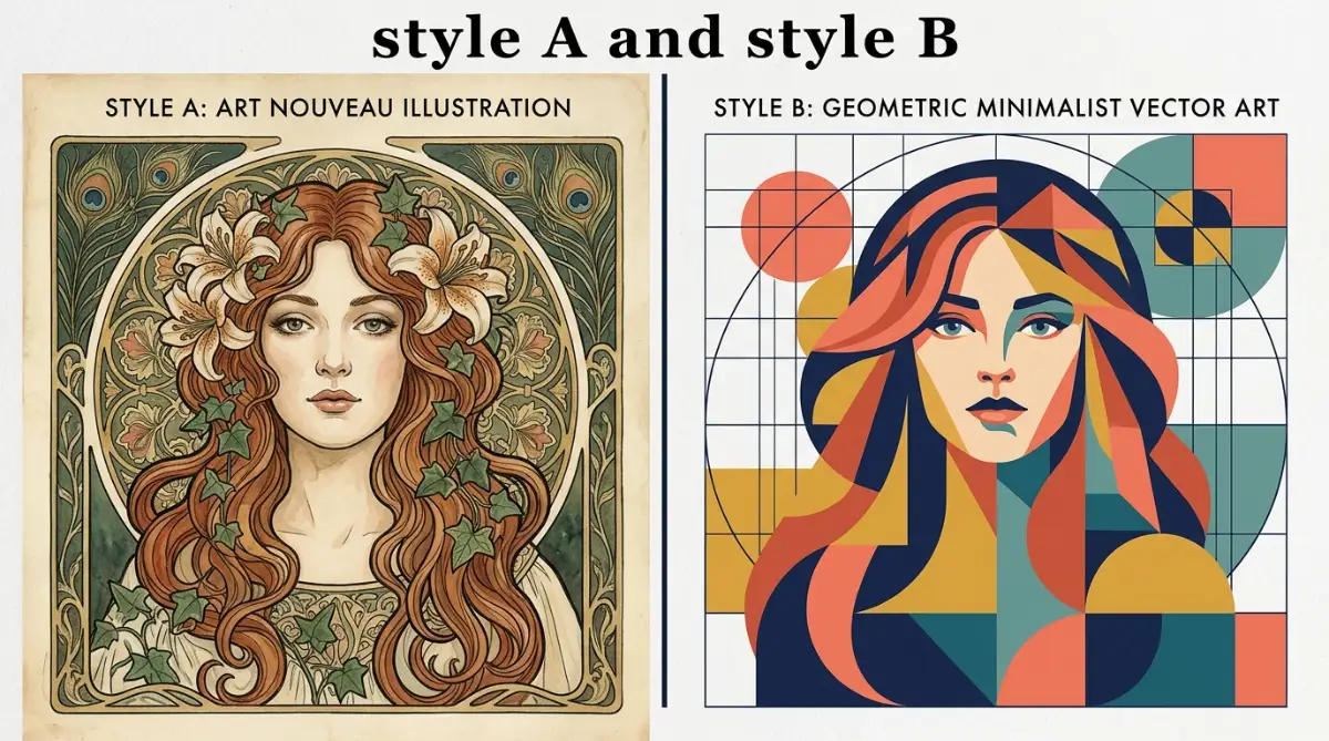
- Using basic prompts: Most guides tell you to just type "style A and style B," which only creates a messy, confusing image.
- Ignoring prompt weights: Without setting weights, the AI usually ignores one style completely and favors the other.
- Copying outdated templates: Relying on generic templates from social media prevents you from developing your own unique artistic voice.
- Forgetting background depth: Many creators do not specify background elements, leading to flat and crowded designs.
- Using conflicting genres: Trying to mix styles that naturally fight each other creates visual chaos instead of harmony.
This endless cycle of trial and error takes a heavy toll on your mindset. When you cannot get the results you want, it hurts your confidence as a creator.
Here is how this struggle quietly damages your creative peace:
- Feeling like an impostor: You might start to believe you lack the artistic talent needed to master these new systems.
- Wasting precious hours: Spending half your day on failed generations leaves you feeling drained and physically tired.
- Losing creative motivation: The constant disappointment can make you want to avoid starting new design projects altogether.
- Anxiety over visual quality: Knowing your backgrounds look generic makes you nervous about sharing your work with the world.
- Financial waste: Spending money on image generator subscriptions without getting useful results feels highly frustrating.
Fortunately, there is a better way to handle this process. You do not need to be a professional prompt engineer to get beautiful, custom results. By learning a few simple blending rules, you can create backgrounds that look truly spectacular.
A Simple Guide to Merging AI Art Styles Like a Professional
To make your backgrounds look unique, you must treat your prompts like a recipe. If you throw random ingredients into a pot, you will end up with a bad meal. The same exact rule applies to your digital art projects.
You need to know how to combine different elements so they work together instead of fighting for attention. Let us look at the practical steps to make this happen.
Choose Your Core Style Ingredients
Before you write a single word, you must select your styles with care. You need to choose a dominant style and a supporting style.
Your dominant style should make up about seventy percent of the visual weight. The supporting style should fill in the remaining thirty percent.
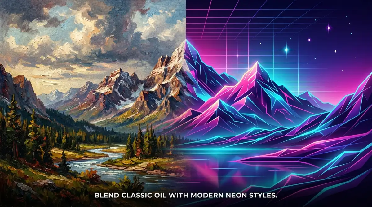
For example, you might choose soft watercolor as your main style. Then, you can add a tiny splash of sharp neon lines to make it feel modern.
This balance prevents your backgrounds from looking like a messy pile of pixels. It gives the viewer's eyes a clear and comfortable place to rest.
Let us think of this like decorating a room in your house. You do not paint every single wall a different bright color.
Instead, you choose one main color for the walls and use a second color for small accents. This simple approach keeps the room looking clean and organized.
When you apply this logic to AI art, your backgrounds instantly look more professional. You avoid the chaotic look that makes amateur AI art so easy to spot.
Write Your First Dual-Style Prompt
Once you have chosen your ingredients, you must write them down clearly. Do not just string random words together with a bunch of commas.
Instead, use structured formulas to guide the creator tool in the right direction. Let us look at a practical prompt formula you can use right now.
A good formula looks like this: [Main Scenery] in [Dominant Style], blended with [Supporting Style] accents, [Color Palette]. This keeps your instructions clean and easy for the AI to understand.
Let us apply this formula to a real-life scenario. Imagine you want a calm mountain background for a new website.
You could write: A quiet mountain range in minimalist flat vector style, blended with subtle oil painting textures, warm pastel colors. This prompt tells the tool exactly what to do.
It keeps the simple, clean shapes of the vector style. At the same time, it adds the rich, warm texture of oil paint.
The tool does not get confused because you gave it clear jobs for each style. You will get a beautiful background that feels both modern and classic.
Master the Magic of Style Weighting
Sometimes, the generator might favor one style too much. When this happens, you need to use prompt weighting to balance things.
In Midjourney, you can use double colons to set these specific weights. This is a simple trick that completely changes your results.
For example, you can write: watercolor background::2 neon lines::1. This text tells the system that the watercolor look is twice as important as the neon lines.
In Stable Diffusion, you can use parentheses to increase or decrease style power. You might write: (watercolor style:1.2) and (neon lines:0.8).
Adjusting these numbers gives you complete control over the final image. It is just like turning a volume knob up or down until the music sounds perfect.
You do not have to guess and hope for the best anymore. You can actively guide the system to match the exact vision in your head.
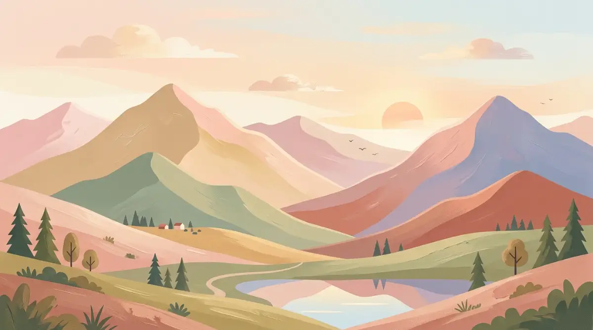
The Soft and Modern Mix: Pastel Flat Art & Pencil Sketch
This specific mix is perfect for clean, modern website backgrounds. It combines the bright, friendly look of flat art with the hand-drawn feel of pencil sketches.
The flat art keeps the background simple and easy to look at. The pencil sketch adds a beautiful, warm human touch to the edges of the shapes.
Use this combination when you want your website to feel friendly and welcoming. It works incredibly well for lifestyle, parenting, or personal blogs.
Here is a prompt example you can try: A simple forest background in pastel flat art style, with light pencil sketch outlines, soft green and cream colors. This prompt creates a peaceful setting that does not distract from your main text.
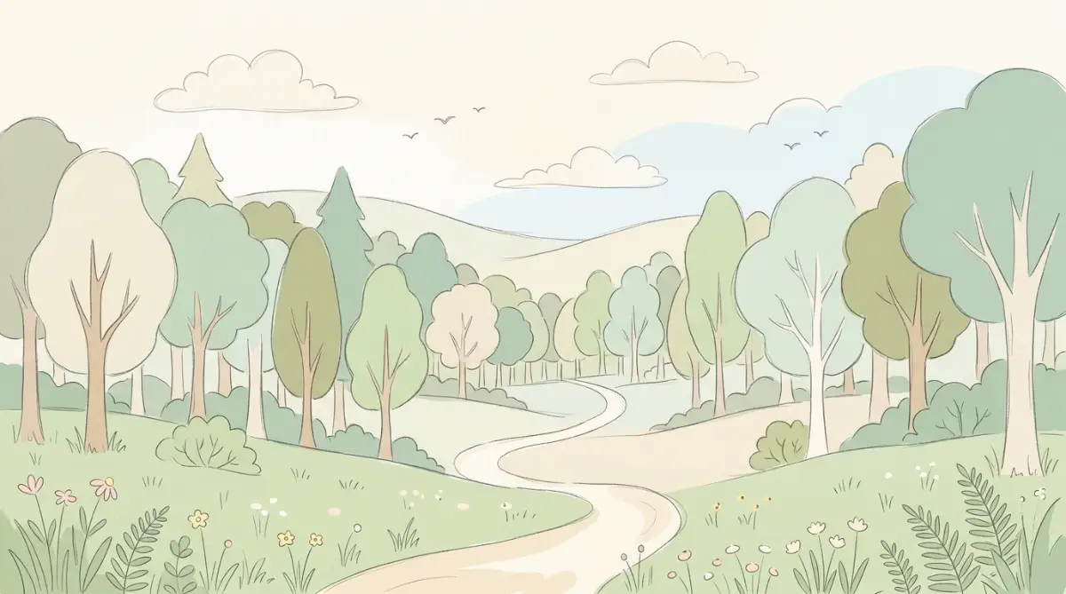
The light outlines give the flat shapes a bit of personality. It looks like a professional illustrator spent days working on it by hand.
Your readers will love the cozy feeling this background creates on your pages. It makes your site feel less like a cold screen and more like a real book.
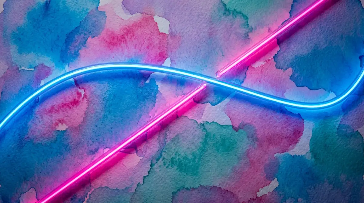
The Retro-Futuristic Mix: Vintage Art Deco & Cyberpunk Neon
This is an exciting blend of old-school luxury and futuristic technology. It uses the sharp, elegant geometric lines of Art Deco along with bright neon colors.
The result is a highly unique background that grabs attention instantly. It is perfect for tech blogs, gaming sites, or music channels.
Try using gold and deep purple as your main colors for this mix. The contrast will make your final design look incredibly rich and expensive.
An example prompt for this style is: A geometric city skyline in 1920s Art Deco style, mixed with glowing cyberpunk neon pink and gold accents, dark background. The AI will create a stunning background that feels both classic and futuristic.
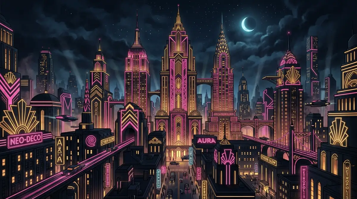
The sharp lines of the Art Deco style keep the glowing neon from looking too messy. It looks clean, organized, and highly creative.
This style works best when you want to make a bold statement. It shows your audience that you are not afraid to try new and exciting visual ideas.
The Natural and Cozy Mix: Japanese Ukiyo-e & Soft Gouache Paint
If you want a peaceful and organic background, this is the perfect choice. Ukiyo-e provides beautiful woodblock lines and natural subjects like waves and clouds.
Gouache paint adds a soft, chalky texture that makes the entire image feel cozy and warm. This mix works wonders for wellness, travel, or mindfulness websites.
Keep the colors earthy, using soft forest greens, warm browns, and gentle sky blues. This combination creates a relaxing atmosphere for your readers.
You can use a prompt like: A quiet ocean shore with soft waves in Japanese Ukiyo-e style, blended with thick gouache paint textures, earthy muted tones. This prompt produces a beautiful, soothing image.
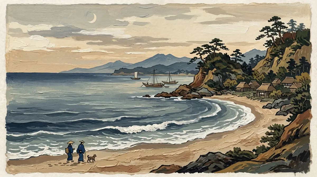
The thick paint texture softens the sharp woodblock lines of the classic Japanese style. It looks like a high-end painting you would find in a modern art gallery.
Your visitors will feel an instant sense of calm when they land on your page. This is a great way to build trust and keep people on your site longer.
How to Avoid the Distracting Background Trap
A background should always support your main content, never distract from it. Many creators make the mistake of creating backgrounds that are way too busy.
When a background has too many details, it makes your text hard to read. This ruins the user experience and drives visitors away from your site.
To avoid this, always leave plenty of negative space in your prompts. Tell the AI tool to leave parts of the image simple and empty.
You can add terms like "minimalist background" or "soft focus" to your prompts. This keeps the main details soft and out of the way of your text.
Another useful trick is to use low-contrast colors. When colors are similar in tone, the background naturally stays in the background.
For example, mix light grey with soft blue instead of bright yellow with deep black. Your text will stand out clearly, and your site will look highly professional.
Real-World Scenarios: Putting the Steps Into Practice
Let us look at how this works in a real design project. Imagine you run a blog about productivity and work habits.
You need a fresh background image for your homepage. A plain stock photo feels too boring, and a standard AI image looks too fake.
You decide to blend isometric 3D design with watercolor textures. This mix brings together clean, modern shapes and soft, artistic colors.
You write a prompt that balances these two different styles. The result is a clean desk setup with soft, artistic colors that fits your brand perfectly.
Your readers will notice the quality difference immediately. It shows that you care about the small details of your platform.
This approach helps you build a unique visual brand. People will start to recognize your images even when they see them on social media.
A Simple Checklist for Your Next Generation
Before you press the enter key on your next prompt, run through this simple checklist. It will save you time and prevent you from wasting your generation credits.
- Have I chosen a dominant style? Make sure one style has more weight than the other.
- Are the colors coordinated? Limit your palette to three or four matching colors.
- Is the background too busy? Ensure there is enough empty space for your text.
- Did I use correct weight numbers? Double-check your colons or brackets before generating.
- Is the subject simple? Keep the main subject basic so the styles can blend smoothly.
By following this checklist, you will get better results on your very first try. You will not have to waste time running the same prompt over and over.
Going Beyond the Basics: Advanced Blending Secrets for Custom Environments
When we work with modern digital tools to generate custom backgrounds, we often need to study advanced methods. Simply typing basic phrases into systems like Midjourney will only get you standard results that look like everyone else's work. To create something truly unique, you need to understand how the system processes complex instructions.
This part of our guide will show you how to mix deeper technical parameters with classic artistic rules. We will look at how to control your generations with absolute precision. This approach will save you time and help you build a professional design library.
Learning how professional software platforms like Adobe handle layout designs can also help you understand how to structure your AI art. By studying traditional design spacing, you can guide the AI to place its visual elements exactly where you need them. This knowledge changes the way you write your prompts from the very first try.
Mixing Art Mediums with Digital Formats
One of the best secrets to creating custom backgrounds is mixing traditional physical art mediums with modern digital file formats. Many creators only specify one style, like "oil painting" or "digital vector."
When you combine a physical medium with a digital format, the AI creates an entirely new visual style. This combination results in a unique texture that works perfectly as a background because it has both depth and clean edges.
Let us look at a practical example of this method. You can pair a heavy, physical medium like impasto palette knife paint with a clean digital format like flat vector design.
The AI will try to create a clean vector image but will fill the shapes with thick, textured paint lines. This contrast makes your background look fresh and modern while retaining a beautiful handmade quality.
Here is an exact prompt structure you can try:
A quiet forest path in vector illustration style, with heavy impasto paint textures and thick palette knife strokes, soft forest colors.
Prompt Formula: [Subject] + [Digital Format Style] + with [Physical Medium Texture] + [Color Scheme]
When you run this prompt, the system does not get confused. It uses the vector layout to keep the shapes simple and clean.
Then, it applies the thick paint texture inside those simple shapes. This setup keeps your background from becoming too busy, making it perfect for website headers or presentation slides.
You can also try mixing colored pencil sketches with 3D isometric renders. This combination creates a clean, three-dimensional room layout that looks like it was carefully colored by hand.
It is a great choice for tech websites or educational blogs that want to feel warm and human. The soft pencil lines take away the cold, robotic feel that is common in standard 3D renders.
Utilizing Multi-Prompt Structures and Seed Values
If you want to create a series of matching backgrounds for a brand, you cannot rely on random generations. You need a system that gives you consistent styles across multiple different images.
To achieve this consistency, you must learn how to use multi-prompting and seed values in your creative workflow. These advanced tools let you lock down the visual style of your first successful generation.
A seed value is a unique number that the AI system uses to start building your image. In Midjourney, you can find this number by reacting to your job with an envelope emoji.
The system will send you a message with the exact seed number. You can then use this number in your next prompt by adding --seed [number] at the very end.
Example Workflow:
1. Generate: "Watercolor background with soft gold ink lines" -> Get Seed: 12345
2. Next Image: "Watercolor mountain background with soft gold ink lines --seed 12345"
Using the same seed number ensures that the new image uses the exact same color tones, brush strokes, and lighting as your first image. This is a game-changer when you need five or six different backgrounds that look like they belong in the same set.
Your website or social media feed will look highly organized and professional because the visual theme remains completely stable.
In addition to seed values, you can use Nagitive Prompts to tell the system what not to include in your background. If your mixed style keeps creating unwanted elements like glowing lights or complex details, you can easily filter them out.
Use parameters like --no glowing effects or [negative prompt: complex details] to keep your custom backgrounds simple, clean, and ready for text overlays.

Five Common Mistakes That Can Ruin Your Custom Backgrounds
Even when you follow all the right steps, it is easy to make simple mistakes that ruin your final design. These mistakes can make your custom backgrounds look messy, unprofessional, or completely unusable.
By learning what these pitfalls are, you can avoid them entirely and save yourself hours of wasted effort. Let us examine the five most common mistakes that creators make when trying to blend AI art styles.
1. Overcomplicating Your Prompts with Style Word Clutter
The most common mistake people make is adding too many style words to a single prompt. Creators often think that writing "3D, watercolor, oil painting, vector, sketch, photorealistic" will give them a highly detailed image.
In reality, this style clutter only confuses the system. The AI gets pulled in too many different directions and ends up creating a muddy, chaotic mess.
To fix this, keep your style choices limited to two core styles per prompt. This limitation gives the system a clear path to follow.
It allows the generator to blend the textures and lines smoothly instead of forcing conflicting rules onto the same canvas. Your final background will look much cleaner and more intentional.
2. Forgetting to Match Your Colors with Your Core Message
Another major pitfall is ignoring the psychology of colors when mixing styles. If you are creating a background for a calm meditation blog, you should not mix heavy neon cyberpunk styles with dark gothic colors.
Even if the blending itself is technically perfect, the colors will send the wrong message to your audience. The visual tone of your background must always match the content that sits on top of it.
Always choose your color palette first and include it clearly at the end of your prompt. Stick to earthy tones for natural topics, pastels for friendly topics, and deep metallics for modern tech topics.
This simple color discipline will make your backgrounds feel much more cohesive and professional. It ensures that your visual assets support your brand's core message.
3. Placing Heavy Details in the Center of Your Image
When you design a background, you must remember that it is meant to stay in the background. Many creators make the mistake of placing a large, detailed subject right in the middle of their generation.
If your background has a massive, highly detailed castle or character in the center, you will not have any place to put your website text. The text will overlap with the detailed art, making it completely impossible for your readers to scan your pages.
Instead, always guide the AI to place its main details on the sides or corners of the image. You can do this by using phrases like "wide empty center space" or "framed border layout" in your prompts.
This technique keeps the center of your image soft and clean. It gives you a perfect, high-contrast area to display your website headers or social media copy.
4. Overpaying for Tool Subscriptions Without a Clear Plan
Many new digital designers sign up for three or four different AI art platforms at the same time. They get excited by all the new features and start paying high monthly fees for tools they rarely use.
This habit quickly drains your bank account and puts unnecessary stress on your creative business. You do not need every single tool on the market to create beautiful backgrounds.
Pick one reliable platform like Midjourney or Stable Diffusion and master it completely before moving on to another. This focus will save you money and help you learn the selected platform's unique language inside and out.
You will get much better results by mastering one tool than by being average at four different ones. Plus, your monthly creative budget will stay healthy and easy to manage.
5. Relying on Only One Style Combination for Everything
Once creators find a style combination that works, they often use it for every single project. For example, if they successfully blend watercolor and pencil sketch once, they will use it for tech blogs, food blogs, and corporate sites.
This repetitiveness makes your portfolio look incredibly boring and limits your growth as a designer. Different industries require completely different visual moods.
Keep experimenting with new combinations and document your successful formulas in a personal design journal. This practice keeps your work fresh and exciting for new clients.
It also helps you develop a wide range of design skills that can handle any creative challenge. Your portfolio will show that you are a highly versatile artist who can adapt to any brand's unique needs.
Your Practical Roadmap to Creating Beautiful Custom Art Today
Learning how to combine multiple AI art styles is a fun and rewarding journey that can transform your digital projects. By breaking away from generic templates, you can build a highly customized visual identity that captures attention instantly.
The secret lies in finding the perfect balance between your dominant and supporting styles, controlling your weights, and keeping your layouts simple and clean. You now have all the tools and formulas you need to start generating professional backgrounds today.
Do not let the fear of making mistakes keep you from getting started. Every failed generation is just a small step that teaches you how the system reads your instructions.
Open up your favorite AI image generator right now and try mixing two styles you have never paired before. You might be surprised by the beautiful, unique textures you can create with just a few carefully selected words.
As you build your custom background library, remember to stay organized and manage your resources wisely. Keep track of your prompts, save your favorite seed numbers, and keep your business expenses well-planned.
With time and practice, you will develop a signature visual style that sets your work apart from the rest of the digital world. The journey to mastering this new form of digital art starts with your very next prompt.
Disclaimer:
The design methods, financial tips, and prompt formulas shared in this article are for educational and informational purposes only. When generating images with artificial intelligence, always make sure you follow the terms of service of your selected software platform. Additionally, respect the copyright guidelines of major social networks like Facebook and Pinterest by avoiding the replication of copyrighted brand assets or trademarked designs.