The Secret Struggle of Creating Unique AI Art Backgrounds
We see beautiful AI images everywhere we look on the internet today. But if you are a creator, you might feel like something is missing.
You open your favorite AI tool and type in a quick prompt for a clean background. What you get back is often a shiny, plasticky image that looks like a million other files online.
It feels generic, cold, and completely empty of any real human soul. You try changing a few words, but the tool keeps spitting out the same boring results.
This repetitive cycle can make you feel extremely frustrated with your creative work. You want your brand or project to stand out, but your tools seem to limit your imagination.
Many creators feel stuck in this silent, annoying struggle every single day. Let us look at why this happens and how we can easily break free from it.
Why Standard AI Prompts Fail to Deliver Custom Results
- Overuse of common buzzwords: Most online guides tell you to write words like "photorealistic" or "hyper-detailed" to get good images. These terms actually force the AI to use its most common, over-used training data.
- Ignoring the science of style mixing: People often try to describe a whole scene instead of focusing on the underlying artistic rules. Without mixing specific styles, the generator defaults to its standard, boring medium.
- Relying on a single art movement: Using only one style makes your background look like cheap stock photography. True depth comes when you mix two or more contrasting artistic eras.
- Forgetting about texture and lighting: A good background needs physical depth, which simple prompts cannot build on their own. You need to tell the AI how different materials should interact with light.
How Generic Outputs Hurt Your Creative Confidence
- You lose your unique voice: When your backgrounds look like everyone else's, your overall project loses its special personality. You start to feel like an editor rather than a true visual creator.
- You waste hours of valuable time: Regeneration buttons become a trap that keeps you clicking for hours. This endless waiting tires your mind and leaves you with less energy for writing or coding.
- Your audience loses interest: Modern viewers can spot basic, untouched AI art in a single second. If your backgrounds look cheap, people will assume your entire project lacks high quality.
- You start doubting your talent: It is easy to feel like you are bad at design when the software does not cooperate. This doubt can stop you from publishing your best ideas.
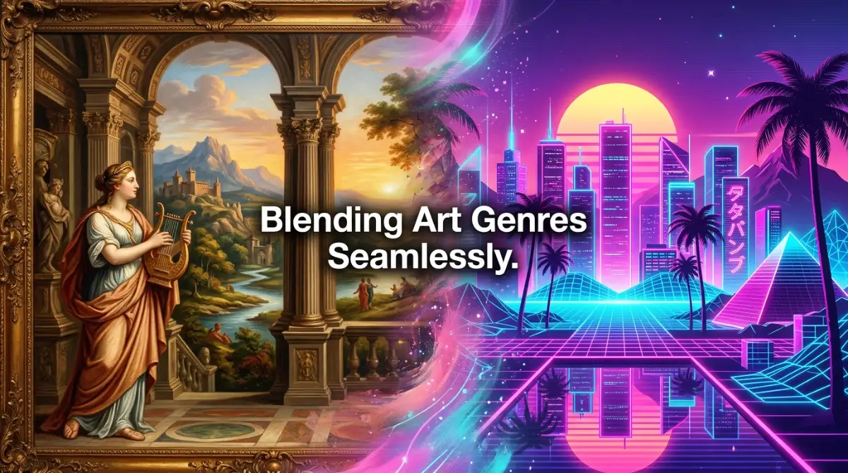
The Science of Combining Contrasting Art Styles
To fix this problem, we need to learn how to mix different art styles correctly. Think of AI art generators as massive visual libraries waiting for your specific instructions.
When you ask for just one style, you only open one book in that library. But when you learn to mix styles, you create a brand-new visual language.
Let us explore three clear, actionable steps to help you master this blending process.
Step 1: Pick Styles That Work Together (The Rule of Contrast)
The first step to a great background is choosing styles that naturally balance each other. If you mix two styles that are too similar, the final image will just look messy.
Instead, we want to choose styles that offer a clean visual contrast. For example, you can mix a highly structured style with a soft, flowing style.
Think of it like cooking a great meal. You need a mix of sweet and savory elements to make the dish taste special.
Pairing Structured and Organic Styles
We can start by combining sharp geometric designs with soft watercolor textures. Geometric shapes provide a strong, clean grid that guides the viewer's eyes.
Meanwhile, the watercolor brings in soft colors, beautiful bleeding edges, and organic warmth. This mix ensures your background does not look too cold or too chaotic.
Another great option is to pair modern line art with classic oil paintings. The thin black lines keep the image clean, while the thick paint strokes add real physical depth.
Balancing Colors and Textures
We must also think about how different art mediums handle colors. A style like cyberpunk uses bright, glowing neon lights.
If you blend cyberpunk with a classic pencil sketch, the neon lights will glow beautifully against the dark graphite shadows. This creates a striking background that immediately grabs attention.
You can also combine flat vector art with retro comic book halftone dots. The flat colors keep the background simple, while the dots add a nice vintage texture.
Style Combinations to Try:
- Gothic Architecture + Art Nouveau: This mixes dark, heavy stone structures with flowing, elegant floral curves.
- Impressionist Painting + Glitch Art: This blends soft, light-filled brushstrokes with modern digital errors and bright colors.
- Ukiyo-e Woodblock Prints + Minimalist Flat Design: This pair matches historical Japanese line work with simple, modern shapes.
Step 2: Master Prompt Weighting and Structure
Once you choose your styles, you must explain them clearly to the AI image generator. Different tools have different ways of reading your words.
If you write a long, confusing paragraph, the generator will get confused and ignore half of your request. We need to structure our prompt so the machine knows exactly what to prioritize.
Let us look at how to build a clean prompt that balances your chosen styles perfectly.
The Power of the Double Colon in Midjourney
If you use Midjourney, you have access to a amazing tool called prompt weights. This allows you to tell the machine exactly how much of each style you want.
You do this by using a double colon :: followed by a number. This tells the generator to treat each style as a separate, important concept.
For example, look at this structured prompt:
minimalist line art background::2 watercolor pastel textures::1 --ar 16:9
In this example, the AI knows to make the line art twice as strong as the watercolor texture. This keeps the background clean while still adding a beautiful, soft color wash underneath.
Using Parentheses for Weighting in Stable Diffusion
If you prefer using Stable Diffusion, you can control style weights using parentheses and decimal numbers. This gives you incredibly precise control over your final output.
A typical weighted prompt for Stable Diffusion looks like this:
a clean background, (minimalist line art:1.2), (watercolor textures:0.8), soft pastel colors, simple shapes
The number 1.2 boosts the strength of the line art, while the 0.8 gently tones down the watercolor texture. This keeps the two styles from fighting for attention in your image.
Keeping Your Prompts Clean and Simple
We must avoid cluttering our prompts with useless words that confuse the AI. Avoid terms like "beautiful," "stunning," or "award-winning" because they carry no real stylistic meaning.
Instead, use clear nouns and specific art movements to describe your vision. Talk about the medium, the lighting, the color palette, and the physical textures.
By keeping your prompts clean, you make it much easier for the generator to blend your styles beautifully.
Step 3: Refine Your Output with Iterative Tuning
Getting the perfect blended background rarely happens on your very first try. You must learn to treat the process as a fun, creative conversation with the tool.
When you generate your first set of images, look closely at how the styles are mixing. Is one style completely taking over the other?
If so, do not panic. We can easily adjust our words or parameters to bring back the balance we want.
The Visual Balance Test
Look at your draft image and ask yourself these simple questions:
- Can I easily see elements of both styles in the background?
- Is the image too busy or distracting for a background?
- Do the colors work together nicely, or do they clash?
- Is the texture smooth enough to allow text to be written on top of it?
If the background is too busy, try reducing the weight of the more complex style. If the colors clash, define a strict, limited color palette directly in your prompt.
Real-Life Scenario: Creating a Website Hero Background
Let us imagine you are designing a background for a modern tech startup website. You want it to look futuristic but also warm and human.
You decide to combine abstract 3D glass shapes with soft charcoal sketches.
On your first try, the 3D glass is too bright and shiny, making the charcoal look like dirty dust on the screen. To fix this, you adjust your prompt to give the charcoal sketch more weight.
You also specify "light gray charcoal lines" to soften the dark shadows. On your next run, you get a beautiful, soft background with glowing glass shapes nestled in elegant hand-drawn textures.
The Magic of Image-to-Image Blending
Another fantastic way to mix styles is by using an existing image as a style reference. You can upload a photo of a style you love and ask the generator to apply it to a new prompt.
For example, you can upload a classical painting and ask the AI to use its colors to render a modern geometric design. This technique guarantees a truly unique result that no one else can easily replicate.
It bridges the gap between different eras of art history with just a few clicks.
Understanding the Visual Math of Style Blending
To help you visualize how this works, let us look at a simple breakdown of how different prompt elements affect your final background.
Style Element A Style Element B Bl ended Visual Result Best Use Case Sharp Vector Art Grungy Rust Textures A clean, modern design with subtle earthy textures and weathered surfaces. Tech blogs, urban branding, and modern poster designs. Renaissance Oil Paint Neon Synthwave Lights Rich, dramatic brushstrokes illuminated by glowing pink and blue artificial lights. Gaming backgrounds, music album covers, and creative portfolios. Traditional Ink Wash Minimalist Geometric Shapes Soft, bleeding black ink fills framed by sharp, perfect white circles and squares. Clean minimalist websites, book covers, and presentation slides. Claymation Textures Bauhaus Poster Design Thick, playful matte textures organized in strict, bold architectural layouts. Children's brands, creative agencies, and fun social media posts.
By studying this table, you can see how blending is not random. It is a thoughtful process of combining structure with texture to create something beautiful.
Helpful Tips for Social Media Sharing
When you create these gorgeous blended backgrounds, you will likely want to share them on social media. Platforms like Pinterest and Facebook are excellent places to show off your design work.
However, you must follow their rules to make sure your posts get noticed without being flagged as spam.
Creating Pin-Worthy Designs on Pinterest
Pinterest users love clean, inspiring, and helpful visuals. To make your blended backgrounds perform well, share them as step-by-step design templates.
Create a tall image showing the two starting styles on top, and your final blended background at the bottom. Add a helpful title like "How to Mix AI Styles for Web Design" so users know exactly what they are learning.
Always link back to your helpful blog post rather than random homepages. This builds trust with both Pinterest and your visitors.
Engaging Your Audience on Facebook
On Facebook, people love reading stories about the creative process. Do not just post a final image without context.
Write a friendly post explaining the exact struggle you faced while trying to make a custom background. Share the prompt formula you used to solve the problem.
This invites other designers to comment with their own creations, which boosts your post in the Facebook algorithm. Keep your tone helpful, supportive, and completely free of annoying sales pitches.
Technical Considerations for High-Quality Backgrounds
Creating a beautiful design on your screen is only half the battle. You also need to make sure your final files are technically perfect for practical use.
A background that looks great on a small phone screen might look blurry or pixelated on a large desktop monitor. Let us look at how to prepare your images for the real world.
Upscaling Your Blended Images
Most AI generators output images at relatively low resolutions to save processing power. To use these images as website backgrounds or desktop wallpapers, you must upscale them.
Use high-quality, AI-powered upscaling tools to increase your image size without losing sharpness. Look for tools that preserve the natural paint strokes or line details of your blended styles.
Aim for a minimum width of 1920 pixels for standard screens, and 3840 pixels for high-definition displays.
Managing File Sizes for Web Performance
While you want high-resolution images, large file sizes will slow down your website. A slow website frustrates users and hurts your rankings on search engines like Google.
Always compress your upscaled backgrounds before uploading them to your site. Use modern image formats like WebP, which offer excellent quality at much smaller file sizes than PNG or JPEG.
Keep your background file sizes under 200 kilobytes whenever possible to ensure fast loading speeds.
Building Your Personal Style Library
As you continue to play with different style blends, you will find certain formulas that you absolutely love. Start keeping a private digital notebook of these successful prompts.
Write down the exact words, weights, and seed numbers that gave you great results. Over time, you will build a personal library of unique visual styles.
This library will save you hours of work on future projects. It also helps you develop a consistent visual identity that people will instantly recognize as your own.
Remember, the goal is not to copy other artists, but to find new ways to express your own ideas. Have fun exploring the endless possibilities of AI style blending!
Pro-Level Secrets for Merging Complex Visual Textures
When we build digital designs, we must think about how our background images interact with real-world elements like text, buttons, and user interfaces. A beautiful background is completely useless if it makes your website text impossible to read.
To make sure your blended creations are highly accessible for everyone, it is important to follow established design rules. You can review the official web content accessibility guidelines to understand how contrast ratios affect readability.
Using the right tools will save you from making messy, unreadable designs. Before you start mixing your colors, we recommend using online color resources like digital color harmony tools to plan your palettes.
By checking your color contrast early, your blended art will look professional on any screen. Let us now look at the advanced steps to take your AI style blending to a professional level.
Step 4: Mastering the Power of Negative Space
When we mix two strong art styles, the generator often wants to fill every single pixel with complex details. This can make your final background look cluttered and overwhelming.
To fix this, we must teach the AI to leave empty areas where your text can sit comfortably. This empty area is called negative space, and it is a key secret of professional design.
Forcing the AI to Leave Empty Areas
We can guide the generator by adding specific phrasing to our prompts that demands simplicity in the center of the image. You can use terms like "clean minimalist empty center," "subtle gradient wash," or "smooth open workspace."
When the AI reads these phrases, it pushes the complex blended textures to the outer edges of the frame. This gives you a gorgeous, textured border while leaving a clean area for your text.
Let us look at a simple prompt example that mixes styles while keeping plenty of negative space:
a background mixing art deco gold lines and soft watercolor splatters, clean open minimalist center, soft empty space for text, light pastel colors --ar 16:9
This prompt ensures that the heavy art deco patterns stay on the sides, giving your website headers plenty of room to breathe.
Using High-Contrast Framing
Another great trick is to ask for a "subtle vignette" or "dark faded edges" in your prompt. This tells the generator to make the outer edges of your background slightly darker or softer.
This framing draws the viewer's eye directly to the center of your screen. It also makes white or light-colored text pop beautifully off the background.
By using high-contrast framing, you can mix wild styles like neon punk and charcoal sketches without hurting readability.
Step 5: Utilizing Seed Parameters for Ultimate Style Control
If you want to create a series of matching backgrounds for a website or social media page, you cannot rely on random chance. Every time you submit a prompt, the generator uses a random starting number called a seed.
If you do not lock this number, your backgrounds will look completely different from one another, even if you use the exact same prompt. To maintain visual consistency, we must master seed control.
How to Find and Lock Your Seed Number
In tools like Midjourney, you can find the seed number of any image you have generated by reacting to the image with an envelope emoji. The bot will send you a direct message containing the exact seed number.
Once you have this number, you can add it to the end of your future prompts to keep the style consistent. You do this by typing --seed followed by the number.
For example, look at this structured sequence:
minimalist line art mixed with oil painting textures --seed 84920472 --ar 16:9
When you use this seed, the generator will use the exact same starting noise pattern. This keeps your textures, lighting angles, and brushstrokes looking identical across multiple runs.
Creating Style Templates for Clients
Using seed numbers allows you to build a reliable style template for your creative projects or business clients. You can generate a beautiful style once, grab the seed, and then change the content of the prompt slightly.
For instance, you can change "forest background" to "ocean background" while keeping the same seed. The colors and subjects will change, but the artistic blend of line art and oil paint will look exactly the same.
This is how professional designers build cohesive brand assets without spending weeks drawing everything by hand
Step 6: Blending Analog Textures with Digital Vectors
One of the most exciting secrets of advanced AI blending is mixing real-world physical media with sharp digital shapes. This bridges the gap between old-school fine art and modern graphic design.
You can take a photo of a real piece of paper, a concrete wall, or a hand-drawn pencil sketch and use it as an input.
Using Image-to-Image Settings
Most generators allow you to upload an image to use as a starting point. This is called image-to-image generation, and it gives you incredible control over the final texture.
You can upload a photo of a rough watercolor wash and write a prompt for a geometric vector design. By adjusting the "image weight" or "denoising strength" slider, you can decide how much of the original paper texture shows through.
If you set the strength to a medium level, the AI will wrap your vector shapes in the warm, physical texture of the watercolor paper.
The Magic of Rough Paper and Clean Vectors
This technique works wonderfully when you blend rough textures with smooth, perfect digital curves. The contrast between the dirty, textured paper and the clean digital lines looks incredibly rich.
It removes the cold, artificial feeling that often ruins standard AI art. Your viewers will look at your backgrounds and wonder if they were made on a computer or painted by hand in a real studio.
Critical Mistakes That Ruin Blended AI Backgrounds
Even when you know the steps, it is easy to make simple mistakes that ruin the quality of your blended backgrounds. AI tools are highly sensitive, and a single wrong word can throw off your entire design.
Let us look at five common mistakes that creators make when trying to combine multiple art styles.
1. Over-Prompting and Style Clashing
The biggest mistake people make is trying to mix too many styles at the same time. If you ask the generator to blend cyberpunk, watercolor, classical oil paint, and claymation all in one image, the result will be a chaotic, muddy mess.
Stick to two or three complementary styles at the absolute most. This keeps your designs clean and ensures that each style can be clearly seen in the final output.
2. Ignoring Color Temperature and Harmony
When you blend styles from different eras, their natural color palettes can often clash violently. For example, mixing the warm, earthy tones of Renaissance paintings with the cold, neon blues of synthwave can look highly jarring if not managed carefully.
Always specify a clear, limited color palette in your prompts to keep the colors working together. You can write phrases like "limited palette of soft grays and warm golds" to force color harmony.
3. Forgetting Aspect Ratio Specifications
By default, most AI generators create square images. If you try to stretch a square image to fit a wide computer screen, the textures will become pixelated and distorted.
Always remember to add the correct aspect ratio parameter to your prompt before generating your background. For standard websites and screens, use the --ar 16:9 command to get a wide, professional layout.
4. Skipping the Upscaling Process
Many creators make the mistake of downloading the low-resolution preview images directly from their AI tools and using them as final backgrounds. These small images look extremely blurry and cheap on large retina displays.
Always run your final chosen images through a high-quality AI upscaler to increase their size without losing sharpness. This keeps your textures looking crisp and professional for all your users.
5. Underestimating Text Readability and Contrast
It is easy to get so excited about a beautiful, complex texture that you forget the image is supposed to be a background. If your background has too much high-contrast detail, any text written on top of it will be unreadable.
Always test your backgrounds by placing sample text over them in a photo editor. If the text is hard to read, use a soft dark overlay or reduce the contrast of your background image.
Your Next Steps for Creating Extraordinary Digital Artworks
Learning how to combine multiple AI art styles is like unlocking a brand-new super power for your creative projects. You are no longer limited to the generic, boring styles that everyone else is using online.
By carefully pairing contrasting styles, managing your prompt weights, and keeping plenty of negative space, you can create gorgeous, custom backgrounds that truly stand out.
Remember that great design is all about experimentation and having fun. Do not be afraid to try weird, unexpected style combinations to see what the generator creates.
Start building your personal style library today, and watch your creative projects come to life with beautiful, unique visuals. The only limit is your own imagination!
Disclaimer:
The tips and techniques shared in this article are for educational and informational purposes only. AI image generator tools are constantly changing, and software updates may alter how prompts and weights perform over time. We do not promote or endorse any specific paid AI software, and all advice is provided to help creators improve their personal design workflows. Please ensure your use of AI-generated images complies with the terms of service of the platform you use and any relevant copyright guidelines in your local area.