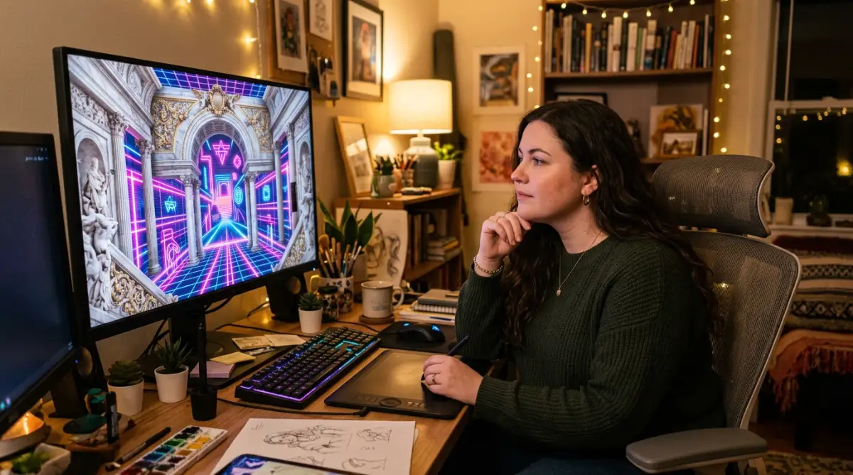
The Secret Battle with Boring AI Backgrounds
Have you ever spent hours typing prompt after prompt into an AI generator only to get the same flat, boring images? You want your digital projects to look unique, but everything the machine creates feels like a cheap copy of something else. It is incredibly frustrating to watch your creative ideas get stuck in a loop of repetitive patterns that do not match your brand.
This common problem leaves many creators feeling completely stuck and ready to give up on digital art tools. You see beautiful, complex graphics on social media and wonder why your own outputs look so basic and robotic. It feels like there is a secret wall blocking you from getting the professional results you actually want.
Many beginners turn to the internet for help but end up finding bad tutorials that make the problem even worse. These guides often teach you to copy long, messy prompts without explaining how the AI actually reads them. Here is why the most common online advice fails to solve your problem:
- Copying Long and Messy Prompt Lists: Simply pasting a huge list of random descriptive words confuses the generator. This confusion leads to muddy colors, weird visual mistakes, and backgrounds that look chaotic.
- Relying on a Single Famous Artist's Name: Using just one famous artist's style makes your work look like a cheap imitation instead of a fresh, modern background. It also limits your ability to create a truly custom look that belongs to your brand.
- Ignoring Visual Chemistry Between Styles: Trying to combine styles that naturally clash without a clear plan creates a messy environment. The generator gets confused trying to apply incompatible rules to the same image canvas.
- Using Useless Technical Modifiers: Adding terms like "ultra-detailed" or "hyper-realistic" makes the generator ignore your main design goals. These words force the AI to use generic patterns instead of the unique styles you want to blend.
[ Your Creative Idea ] ---> [ Copying Messy Prompts ] ---> [ Muddy, Clashing Outputs ]
                                                                     |
[ Structured Approach ] -> [ Visual Chemistry Rules ] ---> [ Clean, Unique Backgrounds ]
This endless cycle of trial and error does more than just waste your valuable hours. It slowly wears down your self-confidence and turns what should be a fun creative process into a stressful chore.
- It Drains Your Mental Energy: Spending your entire evening staring at a screen without producing a single usable design makes you feel tired and defeated.
- It Makes You Doubt Your Own Talents: You begin to think that you are simply not good enough to create professional-grade visual assets for your projects.
- It Steals Your Valuable Project Time: If you design for clients, these wasted hours mean missed deadlines and lost opportunities to earn money.
- It Makes You Feel Disconnected From Your Art: When the generator does all the deciding, you lose that warm feeling of personal connection to your finished work.
The Simple Rules of Visual Compatibility
To create a beautiful background, you must first choose styles that do not fight with each other. Think of this process like planning a nice outfit where the colors and textures need to match. If you mix two styles that are too different, the final image will look messy and hard to read.
+-------------------------------------------------------------+
|                ARTISTIC VISUAL CHEMISTRY                    |
+------------------------------+------------------------------+
|       Style A (Ink Sketch)   |      Style B (Pastel)        |
|       - Sharp borders        |      - Soft borders          |
|       - Defined shapes       |      - Gentle transitions    |
+------------------------------+------------------------------+
|                          RESULT:                            |
|             A smooth, readable, and organic blend           |
+-------------------------------------------------------------+
A great way to start is by picking styles that share at least one common element. For example, you can pair classic ink sketches with soft pastel painting styles. Both styles use gentle transitions and soft borders, which helps them blend together very smoothly.
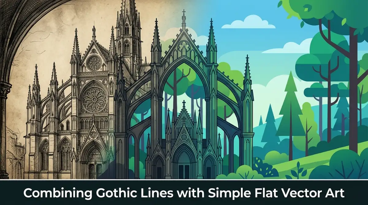
You can also try mixing a highly detailed style with a very simple one to create a nice balance. Think of combining a detailed Gothic architectural style with a clean, flat vector art style. The flat vector shapes will keep the complex Gothic lines from looking too busy or overwhelming for your viewers.
If you are not sure where to begin, try writing down a list of your favorite art movements. Look at their main features, like their line work, color choices, and lighting techniques. Then, choose two that seem to share a similar mood or feeling to help you build your prompt.
We often see designers make the mistake of mixing three or more complex styles right at the start. This usually results in a chaotic design where no single style can shine. Keep things simple by sticking to just two styles until you feel more confident with the process.
Remember that the goal is to create a background that supports your main subject, not one that distracts from it. A well-blended background should feel clean, balanced, and pleasant to look at. By choosing compatible styles, you set yourself up for success before you even write a single prompt.
The Basic Science Behind AI Style Blending
To get the best results, it helps to understand how the AI generator processes your instructions. The generator does not just copy pictures; it breaks your prompt down into two main parts: content and style. Content is "what" is in the picture, while style is "how" that subject actually looks.
The AI looks at style as a pattern of colors, textures, brushstrokes, and lighting. When you ask it to blend styles, it tries to apply the patterns of one style onto the shapes of another. It acts like a digital translator, translating your main subject into a completely new visual language.
If your prompt is too confusing, the translator gets lost and makes mistakes. That is why keeping your descriptions clear and structured is the key to getting a clean blend. By helping the machine understand the boundaries of each style, you get much sharper and more beautiful backgrounds.
How to Balance Prompt Weights for Consistent Results
Once you have chosen your two favorite art styles, you need to tell the AI how much of each style to use. If you do not give clear directions, the generator will simply choose one style and completely ignore the other. This is why learning to balance your prompt words is so important for getting consistent results.
MIDJOURNEY MULTI-PROMPT WEIGHT BALANCING

[ soft watercolor painting::2 ] ==================> 66% Focus (Dominant Texture)
[ cyberpunk city background::1 ] ================> 33% Focus (Secondary Subject)
In many advanced AI image generators, you can use style weights to control this balance directly. This feature allows you to assign a specific number value to each part of your prompt. It is like telling a cook exactly how much sugar and salt to put into a recipe.
For instance, in Midjourney, you might write a prompt like:
soft watercolor painting::2 cyberpunk city background::1 --ar 16:9
The number two tells the generator to focus heavily on the soft watercolor texture. Meanwhile, the number one ensures that the futuristic cyberpunk elements stay in the background without taking over the whole image.
If you are using Stable Diffusion, you can achieve a similar balance by using attention weights with parentheses and numbers. Your prompt would look like this:
(soft watercolor painting:1.2), (cyberpunk city background:0.6)
This syntax tells the system to emphasize the watercolor style while keeping the cyberpunk elements subtle. If you want to learn more about setting up your prompt files.
If you are using a tool like DALL-E 3 that does not support numbers for weights, do not worry. You can achieve a similar balance by using clever descriptive phrasing in your text. Instead of using numbers, you can use words that naturally suggest weight and balance to the machine.
You might write:
"a clean digital background that is mostly clean line art with subtle hints of retro watercolor textures in the corners."
This tells the generator exactly which style should be the main focus and which one should be the secondary accent. It gives you much more control over the final visual output without needing advanced code.
We recommend testing different word balances to see how the AI responds to your changes. Small adjustments in your phrasing can lead to completely different and exciting visual outcomes. Keep your prompts clean and avoid adding useless filler words that might confuse the generator.
Selecting the Best AI Tool for Your Blending Projects
Not all AI image generators handle style blending in the same way. Choosing the right tool for your specific project will make your work much easier and more enjoyable. Let us look at how the three most popular tools handle this process.
Midjourney for Artistic Texture
Midjourney is famous for creating highly artistic and textured images. It is excellent at blending classic art styles and historical painting techniques with modern designs. The tool has built-in features like style references that make the blending process very simple.
DALL-E 3 for Simple Language
DALL-E 3 is wonderful if you prefer using natural, conversational language to describe your ideas. It is incredibly good at understanding complex instructions and keeping your shapes clean and organized. However, it does not support direct weight numbers, so you must rely on descriptive writing.
Stable Diffusion for Full Control
Stable Diffusion offers the absolute highest level of control for advanced users. It allows you to adjust style weights with extreme precision and even train your own custom style models. While it has a steeper learning curve, it is a highly useful tool for professional designers who need complete consistency.
+-------------------+------------------------------------------+
| AI GENERATOR      | BEST STRENGTH FOR BLENDING               |
+-------------------+------------------------------------------+
| Midjourney        | Artistic textures and oil paint blending |
| DALL-E 3          | Understanding conversational sentences   |
| Stable Diffusion  | Precise numerical style weights          |
+-------------------+------------------------------------------+
Using Visual References as a Design Map
Sometimes, words alone are not enough to explain the exact look you want to create. This is when using visual references becomes a game changer for your design workflow. By uploading reference images, you give the generator a clear visual map to follow.
Most modern AI art tools allow you to submit one or two reference images along with your text prompt. You can find an image that has the perfect color scheme and another that has the texture you love. Combining these two sources helps the generator understand your exact vision.
Imagine you find a beautiful vintage poster with soft, warm tones and a modern graphic with clean, sharp edges. You can upload both images and ask the generator to blend their styles into a new background. This approach is much faster and more reliable than trying to describe these complex textures with words.
In Midjourney, you can use the Style Reference parameter (--sref) to achieve this. You paste the link of your reference image right into the prompt:
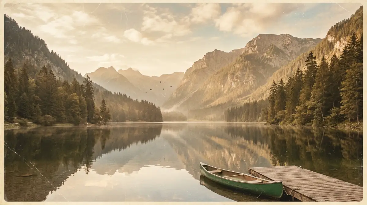
/imagine a quiet mountain lake --sref https://example.com/vintage-style.jpg --ar 16:9
When using this method, it is important to keep your text prompt very simple. Since the generator is already getting lots of information from the images, too much text will only confuse it. Just describe the main subject of your background and let the reference images handle the styling.
We find that this technique is perfect for creating matching sets of backgrounds for your projects. You can use the same reference images while changing the text prompt slightly to create different scenes. This keeps your designs looking consistent across your entire website or social media feed.
Using visual references also helps you avoid the common trap of copying other creators' exact prompts. You are mixing your own selected images to create something completely new and original. For a guide on creating your first prompts.
Exciting Style Combinations to Try Today
Now that you know the basic steps, let us look at some exciting style combinations you can try. These pairings are known to work well together and can give your backgrounds a highly professional look. You can use them for websites, social media, or digital products.
The Dreamy Retro-Futurism Blend
This combination mixes the glowing neon colors of synthwave with the soft, grainy textures of old film photography. The result is a background that feels both modern and nostalgic at the same time. It is perfect for technology websites or music channel backgrounds.
To create this look, try blending clean neon lines with soft, warm light leaks. The grain from the old film style softens the harsh digital glow of the neon colors. This creates a comfortable, moody environment that does not strain the eyes of your viewers.
[ Synthwave Neon Lines ] + [ Old Film Grain ]
                      |
                      v
      [ Soft, Non-Glaring Retro-Futurism Background ]
The Watercolor and Ink Sketch Mix
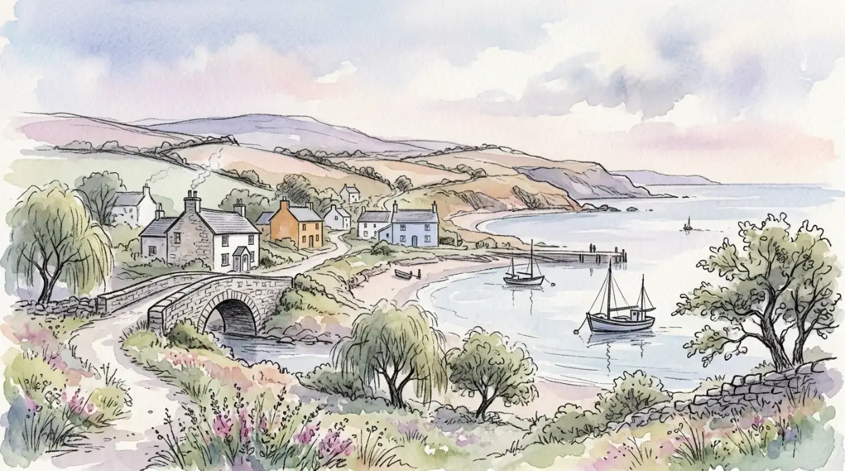
This classic pairing combines the loose, flowing colors of watercolor with the sharp, clean lines of pen drawings. It gives your backgrounds a hand-drawn, artistic feel that looks highly authentic. It is a wonderful choice for personal blogs, book covers, or creative portfolios.
The sharp ink lines help define the shapes in your background, while the watercolor washes add beautiful depth and movement. This mix feels very human and friendly, which helps build trust with your audience. It is an easy way to make your digital work feel more organic.
The Geometric Pop Art Fusion
If you want a background that is bold and full of energy, try mixing clean geometric shapes with bright pop art colors. This style uses strong contrasts and simple patterns to grab the viewer's attention immediately. It works exceptionally well for social media graphics and promotional banners.
The geometric patterns keep the bright pop art colors from looking too messy or unorganized. You get a clean, structured background that still feels incredibly fun and modern. It is a great way to make your brand stand out in a crowded online space.
How to Fix Common Blending Mistakes Quickly
Even with a great plan, you might sometimes run into visual errors or strange results. Do not worry, as this is a normal part of the creative process when working with AI tools. Understanding how to troubleshoot these issues will save you a lot of time and frustration.
Solving the Problem of Muddy and Gray Colors
If your blended background looks dirty or gray, it usually means your styles are fighting over the color palette. This happens when you mix a style that uses very bright colors with one that uses dark, muted tones. The generator gets confused and blends them into a flat, unappealing gray.
To fix this, specify a clear color palette in your prompt to guide the AI. You can add phrases like "using a bright pastel color palette" or "featuring warm golden hour tones". This forces the generator to use clean colors, even when mixing different art styles.
Fixing Strange Visual Errors and Glitches
Sometimes the generator will create weird shapes, floating objects, or blurry patches in your background. This is often caused by using too many conflicting keywords in your prompt. The AI tries to include every single word you wrote, which breaks the image structure.
The easiest way to fix this is to simplify your prompt and remove any unnecessary words. You can also use negative prompts to tell the tool exactly what to avoid in the final image. Adding words like "blurry, low quality, deformed, high contrast" to your negative prompt will quickly clean up your background.
Managing Brightness and Harsh Contrasts
When blending styles like dark Gothic art with bright neon graphics, the contrast can sometimes become too harsh. This makes your background difficult to look at and can hide important details in your design. You want a background that is smooth and easy on the eyes.
Try adding terms that describe soft, even lighting to your prompt to solve this issue. Words like "soft ambient lighting" or "gentle diffused studio light" will help balance the contrasts. This creates a much smoother transition between the dark and light areas of your background.
Why Custom Blended Backgrounds Are Great for Your Projects
Creating your own blended backgrounds offers many benefits that go far beyond just looking pretty. It allows you to build a unique visual identity that people will easily recognize. In a crowded digital space, having a distinct look is highly valuable for your brand.
Building a Consistent Brand Image
When you use standard AI styles, your website or social media feed can end up looking like everyone else's. By creating a custom style blend, you develop a visual signature that is uniquely yours. You can use this same blend across all your digital channels to create a cohesive brand image.
When people see your unique backgrounds, they will instantly associate them with your high-quality content. This visual consistency helps build professional trust and keeps your audience coming back for more. It shows that you care about the details of your presentation.
Saving Money on Costly Stock Assets
Finding the perfect background image in traditional stock libraries can take hours and cost a lot of money. Often, you have to settle for an image that is only "good enough" rather than exactly what you wanted. Blending AI styles allows you to create the perfect asset for free.
You can customize every single detail of the background to match your project's specific needs. Whether you need a specific color to match your logo or a precise mood, you can generate it in minutes. This saves you both time and money while giving you better final results.
Enjoying a Smooth and Fun Creative Process
Once you master the basics of style blending, the design process becomes incredibly fun and relaxing. You are no longer fighting with the tool or getting frustrated by bad results. Instead, you are exploring new visual ideas and discovering beautiful style combinations.
This positive experience brings the joy back into your creative work and helps prevent design burnout. You will look forward to creating new backgrounds and experimenting with different artistic concepts. It turns a tedious task into an exciting part of your daily workflow.
Step-by-Step Exercise: Crafting Your First Blended Prompt
Let us put everything we have learned into practice with a simple design exercise. We will walk through the exact steps to create a beautiful, blended background for a digital project. You can follow along using any AI image generator you prefer.
- First, choose your two styles: For this exercise, we will combine a clean "flat vector graphic" style with a textured "classic oil painting" style. This mix will give us a modern design with a beautiful, rich painted texture.
- Next, structure your prompt: We want the flat vector shape to be the main focus, with the oil painting texture serving as a subtle overlay. We will write our prompt clearly without using any complex filler words.
- Write and run the prompt: Try typing this simple prompt into your generator:
- "A clean background of a calm forest, flat vector style, blended with subtle oil painting textures, soft warm lighting."
- Evaluate the results: Notice how the AI combines the clean shapes of the vector style with the rich brushstrokes of the oil painting. If the texture is too strong, try rewriting the prompt to give more weight to the vector elements.
- Adjust and refine: You might write:
- "Mostly flat vector illustration of a calm forest, with very light hints of classical oil painting textures."
- Compare the changes: Compare the two results to see how your changes affect the final background. Keep practicing this exercise with different style pairings and word balances to master the tool.
Best Practices for Social Media Layouts
If you plan to share your work on platforms like Pinterest or Facebook, there are a few important guidelines to keep in mind. These platforms have specific layout rules that can affect how your backgrounds look to your audience.
Always design your backgrounds with the correct aspect ratio for each platform. For example, Pinterest pins work best with a vertical aspect ratio of two to three (--ar 2:3 in Midjourney). On the other hand, Facebook header images need to be wide and horizontal to fit correctly on desktop and mobile screens (--ar 16:9 or --ar 21:9).
Make sure your backgrounds have enough empty space so you can easily add text overlays later. If your background is too busy, your social media text will be very difficult for people to read. Keep the center or the sides of your image clean and simple for the best results.
We also suggest keeping your color schemes bright and warm for social media platforms. Bright colors tend to grab people's attention much better as they scroll through their feeds. Combining eye-catching colors with unique style blends will help your posts stand out and get more clicks.
A Simple Checklist for Beautiful Style Blends
Before you hit the generate button on your next project, run through this quick checklist to ensure the best possible results. This simple habit will help you avoid common mistakes and save you lots of time.
- Have you chosen compatible styles? Make sure your two selected styles share at least one common element like line work or lighting.
- Is your prompt word balance clear? Ensure the generator knows which style is the main focus and which one is the secondary accent.
- Did you avoid complex filler words? Remove unnecessary words like "hyper-detailed" or "stunning" to keep the AI focused on your design styles.
- Is your lighting soft and balanced? Use terms like "soft ambient light" to prevent harsh contrasts and muddy colors in your background.
- Have you left enough empty space? Keep your design clean so you can add text or other elements to your background later without clutter.
Wrapping Up Your Initial Creative Journey
Combining different art styles is an excellent way to create beautiful, unique backgrounds that stand out. It saves you from the frustration of generic designs and gives you complete control over your creative projects. By following these simple steps, you can turn any basic prompt into a professional masterpiece.
Remember to start with simple pairings, balance your words carefully, and use visual references when you need extra guidance. With a little practice, you will build a gorgeous collection of custom backgrounds that you can use with pride. Enjoy the process of exploring new styles and let your artistic vision light up the digital world.
Many digital designers are starting to realize that basic prompts simply cannot produce the rich, layered environments needed for modern client work. If you want to build truly remarkable visuals, you must look beyond the standard settings of your generation tool. Learning to mix styles properly gives you the power to build custom worlds that feel completely original.
This knowledge will help you make decisions that look intentional rather than random or accidental. If you are still struggling with basic prompts, we have built this next part of our guide to show you the exact advanced strategies used by professional digital artists. Let us explore the deeper mechanics of art blending so you can start creating spectacular backgrounds today.
Advanced Tactics: Merging Artistic Eras
One of the most effective ways to create a unique background is by mixing art styles from completely different time periods. When you combine a style from the classical era with a modern digital aesthetic, something interesting happens. The antique style brings rich textures and human warmth, while the modern style adds clean lines and vibrant energy.
Imagine blending the dramatic, dark shadows of Baroque oil painting with the bright, glowing elements of modern synthwave art. The contrast between deep classical shadows and neon pink lights creates an incredibly moody and interesting scene. This mix works beautifully because the dark areas give the neon colors a perfect platform to shine without glaring.
[ Baroque Chiaroscuro ] + [ Neon Synthwave Grids ]
                  |
                  v
       [ Rich Classical Shadows with Glowing Accents ]
To achieve this blend, you must clearly divide the duties of each style in your text prompt. Use words that assign the structural elements to the modern style and the surface textures to the classical style. You can write:
"A high-tech control room with clean synthwave neon grids, rendered with the heavy brushstrokes and deep shadows of a classic Baroque oil painting."
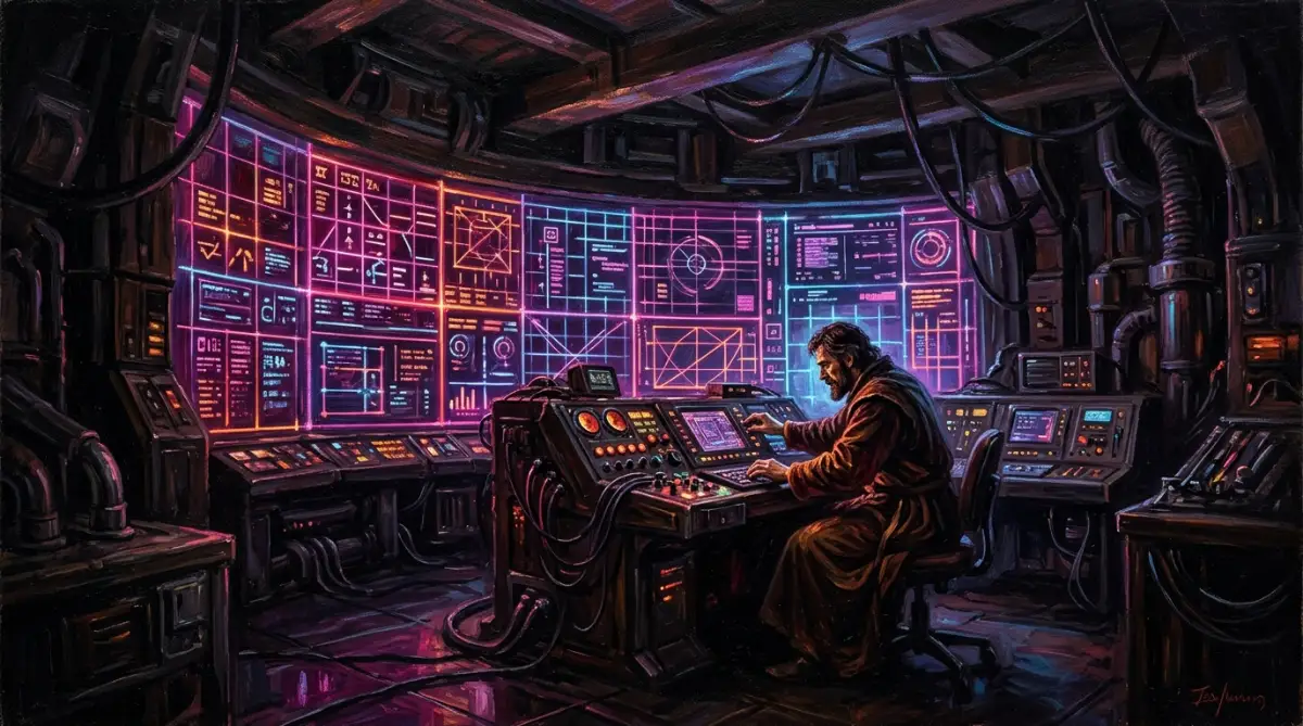
This clear division tells the generator to keep the modern shapes of the control room but paint them with a rich, historical texture. The final image will have the structure of a modern scene but the beautiful feel of an old museum piece. It is a highly effective way to make your backgrounds look completely original.
Another wonderful pairing is combining Renaissance marble textures with the flat, colorful shapes of modern vector graphics. This blend creates a clean, minimalist background that still feels incredibly luxurious and expensive. It is an excellent choice for premium branding websites or sophisticated social media templates.
When writing prompts for this mix, ask the generator to apply marble cracks and classical shadows inside simple geometric shapes. By doing this, you keep the design clean and easy to scan while adding a touch of classic elegance. Experiment with different historical movements to see which combinations fit your personal brand best.
Advanced Prompting Syntax for Absolute Control
If you want to take your digital art to a professional level, you must master the advanced punctuation and syntax of your generator. Many creators do not realize that simple commas are often not enough to separate complex art styles. Using specialized symbols allows you to tell the machine exactly how to divide its processing power.
In tools that support multi-prompting, you can split your text into separate ideas and assign a mathematical value to each. This technique is extremely helpful when you want to mix a very strong style with a highly subtle one. Without these values, the stronger style would easily wash out the smaller details of your secondary style.
Consider a scenario where you want to blend heavy charcoal sketching with soft, flowing watercolor washes. Charcoal is naturally very dark and has harsh, dominant lines that can easily overwhelm soft colors. By using a weight ratio, you can tell the AI to use mostly watercolor and only a small touch of charcoal.
For example, in Midjourney, you can write:
soft pastel watercolor painting::3 charcoal line sketch detail::1
The generator will spend three times more energy on the watercolor textures than the charcoal lines. This ensures your background stays light and dreamy while still having the hand-drawn structure of a charcoal sketch.
If your preferred tool does not use numbers, you can achieve a similar effect by using positional syntax in your paragraphs. AI models naturally pay the most attention to the words at the very beginning of your prompt. Place your primary style at the start and save your accent style for the very end of your sentence.
Learning to balance these weights will save you from wasting credits on random generations that do not match your vision. It is the secret tool that separates amateur AI users from professional digital creators.
How to Maintain Style Consistency Across Multiple Images
Once you find a beautiful style blend, you will likely want to use it for multiple designs in the future. Creating a matching set of backgrounds is important for building a professional and trustworthy online presence. If every page of your website or social media feed looks completely different, your audience will feel confused.
To maintain consistency, you should build a personal library of your most successful prompt formulas. Whenever you get a beautiful output, copy the exact text and save it in a simple document on your computer. Note down which generator you used and any specific settings like aspect ratios or style weights.
We also highly recommend using seed numbers to keep your visual results consistent across different generations. A seed number is a unique code that the AI uses as a starting point to build your image. If you use the exact same seed number with slightly different words, the generator will keep the overall style and layout identical.
This method is perfect for creating a series of matching backgrounds for a website or a presentation. You can change the main subject of your prompt while keeping the style blend words and the seed number exactly the same. The resulting images will look like they were painted by the same artist for the same project.
Another great strategy is to create a master style block of text that you can paste at the end of every prompt. This block should contain your favorite combination of colors, lighting, and textures that define your brand. By keeping this style block constant, you ensure that all your backgrounds share the same professional look.
Building a consistent visual library takes time, but it is highly rewarding for your creative business. It helps you work much faster because you do not have to start from scratch every single time you need a new image.
Five Common Traps That Ruin Blended Backgrounds
When working with style blends, it is easy to make simple mistakes that ruin the entire composition. Let us look at the five most common traps and how you can avoid them.
1. The Over-Prompting Trap (Adding Too Many Style Keywords)
The most common mistake beginners make is writing incredibly long prompts with too many descriptive words. They think that adding more styles will make the image more unique, but the opposite is actually true. When you give the AI too many instructions, it gets confused and starts to ignore your main goals.
This confusion often results in a messy, blurry image with weird visual glitches and distorted colors. To avoid this, try to limit your prompt to just two distinct art styles at a time. Keeping your prompt simple and focused allows the generator to blend the styles with much greater precision.
2. The Color Temperature Clash (Mixing Mismatched Palettes)
Another major trap is trying to mix styles that use completely different and clashing color temperatures. For example, if you blend a warm, sunny impressionist style with a cold, dark cyberpunk setting, the colors will fight for attention. This conflict usually creates a flat, unappealing gray color across your entire background.
Always decide on a dominant color temperature before you write your prompt. You can easily guide the AI by adding a clear color instruction like "featuring warm autumn colors" or "using a cool blue palette". This simple step forces the generator to use matching tones, creating a much more pleasant visual flow.
3. The Resolution Myth (Using Useless Technical Keywords)
Many old guides tell you to add terms like "photorealistic", "8k resolution", or "ultra-detailed" to your prompts. These words are actually useless and can actively damage your blended art styles. Modern AI models already generate high-quality images and do not need these outdated terms to function properly.
Adding these technical keywords can make your beautiful, stylized backgrounds look cheap, artificial, and over-processed. Instead of using generic buzzwords, describe the actual textures and lighting you want to see in your image. Words like "soft canvas texture" or "gentle morning sunlight" will give you much cleaner and more professional results.
4. Ignoring Aspect Ratios during the Blending Process
Many creators forget that the shape of your canvas changes how the AI distributes different art styles. If you generate a style blend in a square shape and then try to stretch it to a wide banner, the layout will break. The generator might place all the styling on one side and leave the other side looking completely empty.
Always set your desired aspect ratio at the very beginning of your creative process. If you need a wide background for a website header, use the horizontal ratio command in your prompt. This tells the generator to design the style blend specifically for that wide canvas, ensuring a beautiful and balanced composition.
5. Lacking a Clear Focal Point (Making the Background Too Busy)
A background is meant to support your main content, whether that is text, a product image, or a human model. If your style blend is too busy and full of high-contrast details, it will distract your viewers from your main message. A noisy background makes your digital project look messy and very difficult to read.
When blending complex styles, always make sure to include some quiet areas with soft, simple textures. You can use terms like "minimalist composition" or "plenty of negative space" in your prompt text. This keeps your background clean and beautiful while leaving perfect spots for your text or products.
Taking Action for Creative Success
We have covered a lot of ground in this guide, from choosing compatible styles to mastering prompt weights and avoiding common design traps. Now, the most important thing you can do is to start experimenting with these techniques yourself. The world of digital art is wide open, and your unique visual voice is waiting to be discovered.
Do not worry about making mistakes or getting bad generations on your first few tries. Every professional digital artist has spent hours testing different word combinations to find what works best. Look at every bad generation as a valuable lesson that brings you one step closer to your perfect design.
To make things easy, we suggest starting with just one style pairing from our list of recommendations today. Open your favorite generator, set up your prompt with a clear division of styles, and see what kind of beauty you can create. Once you see the first gorgeous blend appear on your screen, your confidence will soar.
You have all the knowledge and tools you need to build stunning, custom backgrounds that stand out. These unique designs will give your brand a professional edge and help you connect deeply with your online audience. Enjoy the creative journey, keep exploring new ideas, and let your artistic vision light up the digital world.